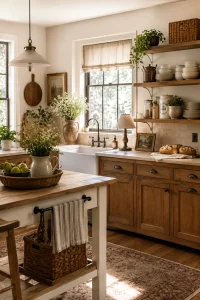
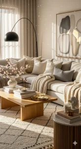
20 Earthy Neutral Palettes for a Cozy Modern Farmhouse Living Rooms
When it comes to modern farmhouse style, nothing beats the charm of earthy neutral tones. They’re soft, welcoming, and effortlessly timeless—perfect for creating a cozy, lived-in vibe in your Farmhouse living room. Whether you’re redesigning from scratch or just adding a few accents, the right neutral palette can transform your space into a warm retreat.
In this post, we’re diving into 20 earthy neutral color palettes that perfectly capture the cozy-modern farmhouse feel. Plus, we’ll include a few styling tips along the way to help you bring these combinations to life.
1. Cream, Oatmeal & Warm Wood color palette
This soft and classic palette is the foundation of farmhouse charm. Creamy whites paired with oatmeal textiles and natural wood tones bring in warmth without overwhelming the space.
Style Tip: Choose linen slipcovers and add a warm-toned wood coffee table for rustic elegance.

2. Greige, Soft White & Weathered Oak color palette
Greige (a mix of gray and beige) brings a refined touch, especially when paired with soft whites and the texture of weathered oak.
Perfect For: Open-concept living rooms that need a light and airy, yet grounded, feel.

3. Taupe, Sage Green & Bone White color palette
Add a muted sage green accent wall or armchair to this earthy combo for a subtle pop of color that feels organic and cozy.
Style Tip: Layer in eucalyptus stems and vintage white pottery for extra charm.

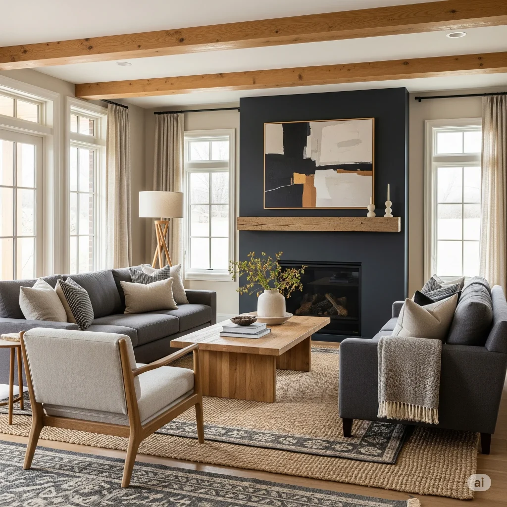
4. Charcoal, Linen Beige & Honey Wood color palette
This palette creates contrast while staying warm and inviting. Charcoal adds depth without the harshness of black.
Use It For: Anchoring neutral furniture or grounding bright rooms.
5. Mushroom, Ivory & Driftwood color palette
Mushroom (a soft, taupe-gray) tones feel elegant and understated. Pair with ivory textiles and driftwood décor for a beachy farmhouse twist.

6. Stone Gray, Sand & Terracotta color palette
A balanced palette that feels rooted and grounded. Terracotta throw pillows or pottery warm up the cooler stone and sand hues.
Design Note: This palette works beautifully with textured rugs and woven baskets.

7. Dusty Rose, Clay & Cream
Add a touch of femininity with dusty rose while keeping things earthy. Clay tones keep the palette grounded and modern.
Try This: Velvet or linen rose-colored cushions with rustic ceramic accents.

8. Pale Mocha, Ecru & Black Iron color palette
Mocha adds a cozy coffee-shop warmth to ecru (a light beige) walls. Black iron accents (think curtain rods or frames) add a modern edge.

9. Pewter, Off-White & Burnt Umber color palette
Pewter is a soft metallic gray that plays well with natural whites and deep burnt browns.
Best For: Industrial farmhouse looks or rooms with exposed beams and metals.

10. Alabaster, Buttermilk & Oak color palette
A warm white-on-white palette that’s anything but boring. Buttermilk brings a creamy richness that feels like sunlight on a Sunday morning.
Perfect Addition: Woven cane accents or rattan light fixtures.

11. Beige, Olive, and Rust color palette
Olive green and rust are bold earth tones that create a dramatic yet natural palette when softened with beige.
Pro Tip: Use this for a boho farmhouse mix—layered textiles, pillows, and kilim rugs.

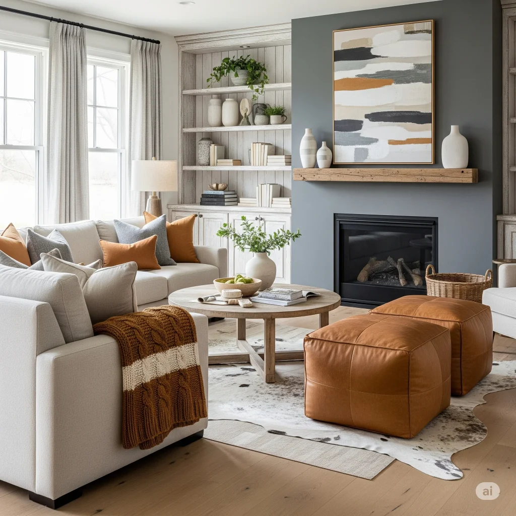
12. Camel, Cream & Iron Gray color palette
Camel tones bring in a leather richness that elevates modern farmhouse interiors, especially when used with gray and cream.
Add Texture: Leather ottomans, cowhide rugs, or stitched throws.
13. Wheat, Whitewashed Wood & Fog color palette
Soft, wheat-colored upholstery mixed with fog-gray throws and whitewashed wood details feels effortlessly serene.

14. Cocoa, Bone & Dust color palette
This subtle brown-based palette mimics the color of cocoa powder and stone dust, creating a grounded and sophisticated aesthetic.

15. Ivory, Charcoal & Burlap color palette color palette
A great combo for modern-rustic lovers. Burlap textures add that handmade farmhouse feel, while charcoal adds polish.
Use For: Neutral couches with burlap throw pillows or wall hangings.

16. Antique White, Ash & Soft Gold color palette
This palette brings a touch of vintage charm. Ash-gray walls or built-ins pair beautifully with antique-inspired furnishings in warm gold.

17. Pine, Beige & Clay color palette
Earthy and rooted, this palette works especially well with farmhouse plants, terracotta pots, and neutral linen drapes.
Design Idea: Add greenery with potted olive trees or snake plants.

18. Warm Gray, Chalk, and Walnut color palette
A simple yet effective palette. The dark walnut adds depth, while warm gray and chalk whites keep it neutral and fresh.

19. Hazelnut, Soft Taupe & Crisp White color palette
Hazelnut and taupe tones create a buttery softness, making the room feel snug and elegant.
Try It With: Plush area rugs and wood-panel detailing.

20. Putty, Ecru & Deep Olive color palette
For a more earthy, moody farmhouse vibe, this palette feels organic and well-worn in the best way.
Pair With: Woven wall art, reclaimed wood accents, and matte-finished furniture.

Bringing It All Together
Choosing the right earthy neutral palette is about more than just color—it’s about texture, light, and how the tones work together in your space. Here are some quick styling tips to help pull everything together:
- Layering is key: Use throws, cushions, and rugs in multiple neutral tones.
- Mix materials: Think linen, cotton, jute, wood, leather, and stone.
- Natural light matters: Earthy neutrals shine best in sunlit rooms.
- Keep it cozy: Add candles, woven baskets, and plush textiles for that lived-in farmhouse feel.
Common Mistakes to Avoid When Choosing a Modern Farmhouse Color Palette
Even the most beautiful color palette can fall flat if it’s not used thoughtfully. Here are a few common mistakes homeowners make when selecting colors for a modern farmhouse living room:
1. Using Too Much Cool Gray
While gray has long been a farmhouse favorite, overly cool shades can make a room feel cold and uninviting. Instead, opt for warmer greige, taupe, or mushroom tones that create a cozy atmosphere.
2. Ignoring Natural Light
Colors can look completely different depending on the amount of sunlight a room receives. Always test paint samples throughout the day before committing to a shade.
3. Choosing Stark White Everywhere
Bright, pure white can sometimes feel sterile rather than cozy. Soft whites, creamy ivories, and warm off-whites are usually better suited to modern farmhouse interiors.
4. Forgetting About Texture
A neutral palette relies heavily on texture for visual interest. Layer materials like linen, woven baskets, wood, leather, and chunky knit throws to keep the space from feeling flat.
5. Adding Too Many Accent Colors
Modern farmhouse design thrives on simplicity. Limit yourself to one or two accent colors—such as sage green, terracotta, or deep olive—to maintain a cohesive look.
6. Matching Everything Perfectly
A home feels more authentic when colors and materials vary slightly. Mixing complementary neutral tones creates depth and character without making the room feel busy.
Quick Tip
When in doubt, start with a warm neutral base, add natural wood tones, and introduce subtle earthy accents through textiles and décor. This approach creates the timeless, welcoming feel that modern farmhouse style is known for.
Final Thoughts
Modern farmhouse living rooms are all about comfort, simplicity, and warmth—and earthy neutral palettes are the heart of that aesthetic. Whether you lean more rustic or more refined, there’s a combination on this list that will fit your style. Use these palettes as your guide, then personalize with textures, patterns, and accents that speak to you.
Struggling to choose paint colors for your modern farmhouse? Explore this guide to the best Sherwin-Williams modern farmhouse paint colors