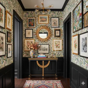
Cherry Blossom to Cherry Red: Transitioning from Spring Pastels to Deep Tones
As the seasons shift from airy spring to the warmth of late summer and fall, our homes crave deeper, richer colors. One of the most elegant transitions you can make is moving from soft cherry blossom pinks to bold cherry red tones — a transformation that feels romantic, cozy, and full of character.
In this guide, we’ll explore how to evolve your décor palette, layer colors naturally, and style your home so it flows seamlessly from spring freshness to autumn depth.
1. The Essence of Cherry Blossom: Light, Playful, and Dreamy
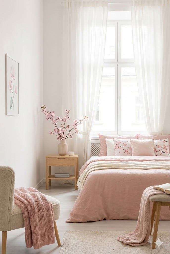
Cherry blossom pink embodies spring — delicate, youthful, and full of light. Think breezy fabrics, floral prints, and pastel accents. It’s a tone that brings softness and optimism to interiors, perfect for spaces like bedrooms, vanities, and cozy reading corners.
Styling tips:
- Use sheer white curtains and blush throws to keep the space bright.
- Add floral cushions and botanical art prints with touches of light pink and green.
- Incorporate ceramic vases, fluted glass décor, or Japanese-inspired cherry blossom art for a poetic touch.
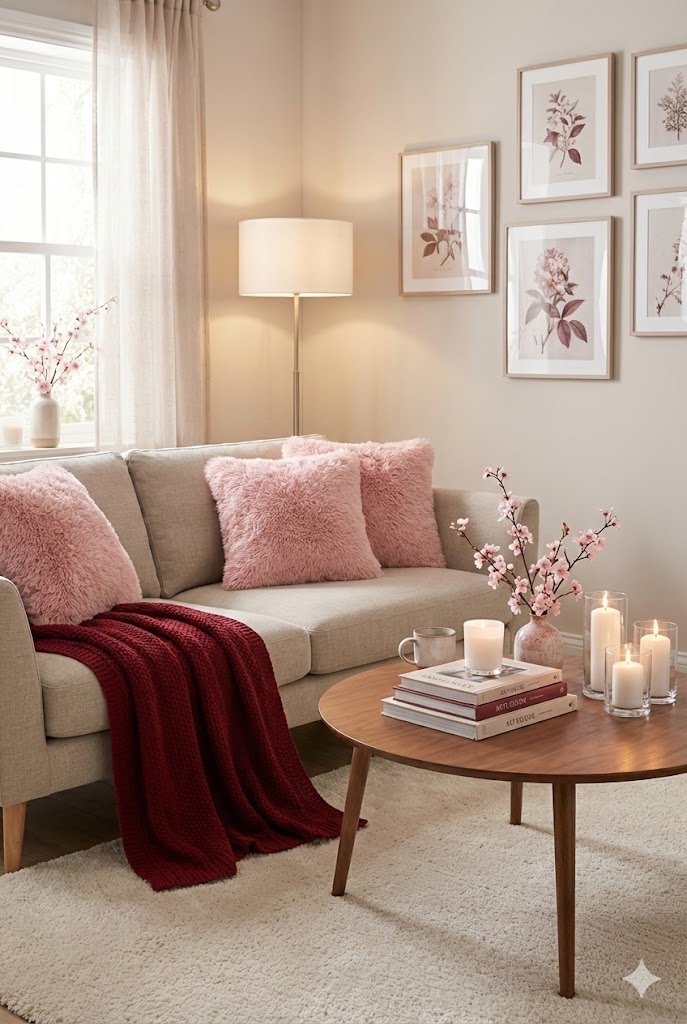
2. Introducing Deeper Hues: The Power of Cherry Red
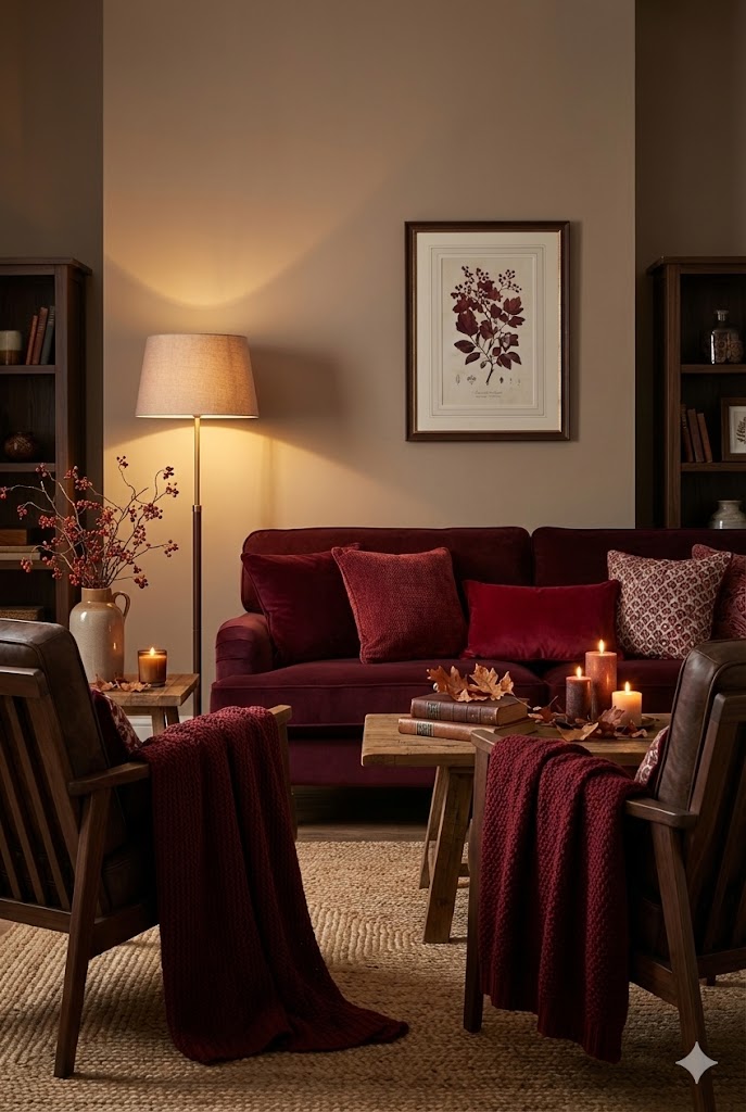
As spring fades, cherry red becomes the bold, confident counterpart to those pastels. It’s the same color story — just intensified. Cherry red interiors feel mature and passionate, yet still retain the playfulness of their pastel origins.
Styling tips:
- Transition gradually by layering rosewood, crimson, and burgundy textiles.
- Swap lightweight linen for velvet or suede cushions.
- Add dark cherry-toned ceramics, glass candle holders, or a statement red vase to build richness without overwhelming the space.
Secondary keywords: cherry red décor, fall color trends, warm home tones, cozy red interiors
3. Creating a Seasonal Flow
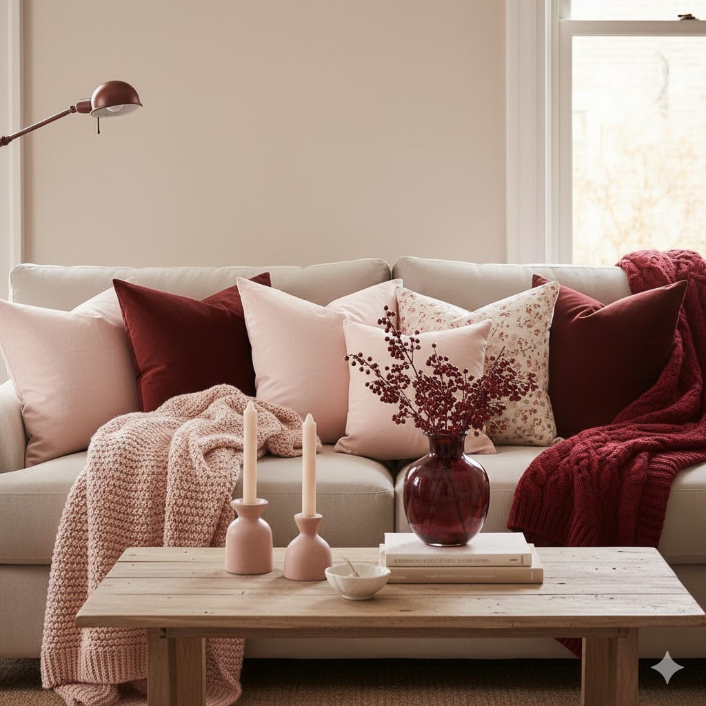
A successful seasonal transition is about balance. Instead of completely redecorating, blend the two palettes — soft pink and cherry red — to create depth.
Ideas for smooth transitions:
- Mix pink peonies with red roses in your floral arrangements.
- Combine pastel bedding with a cherry red throw blanket.
- Display pink glassware beside burgundy ceramics for a cohesive yet layered vignette.
- Use accent lighting like warm LED fairy lights or gold sconces to enhance the richness of cherry tones.
4. Materials and Textures to Complement the Palette
Color transitions look most natural when textures shift alongside hues.
For spring (cherry blossom phase):
- Lightweight cotton, sheer voile, and woven rattan.
- Glass and ceramic with a glossy finish.
For autumn (cherry red phase):
- Velvet, boucle, and brushed cotton.
- Brass accents and matte ceramics for warmth.
Try introducing texture layering — a pink linen table runner topped with a burgundy velvet centerpiece instantly adds visual depth.
5. Décor Ideas for Different Spaces
Bedroom:
Switch floral pastel bedding to a rose-to-cherry ombre quilt and pair with gold bedside lamps. Add cherry-toned candles for a romantic mood.
Living Room:
Update pastel cushions with deep red throws. Incorporate dark wood or walnut coffee tables for a grounded feel.

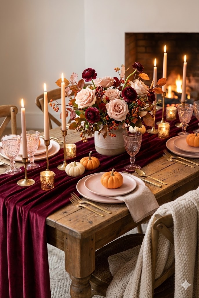
Dining Area:
Combine pink glass vases with burgundy table runners and crystal candleholders for an elegant, transitional tablescape.
6. Cherry-Inspired Accents to Shop
(Perfect for an affiliate roundup section)
- Velvet cherry red cushions – cozy yet luxe
- Cherry blossom wall art – for a soft floral statement
- Crimson ceramic vases – ideal for seasonal blooms
- Blush-toned glass candle holders – keep the romantic glow year-round
- Burgundy velvet curtains – dramatic and timeless
7. How to Transition on a Budget (Without Rebuying Everything)
You don’t need a full room makeover to shift from cherry blossom pastels to deep cherry red tones. Small, thoughtful swaps can completely transform the mood of a space while keeping your décor sustainable and budget-friendly.
Smart transition tips:
- Keep neutral bases (sofas, rugs, curtains) and rotate only accent pieces.
- Swap cushion covers instead of entire pillows.
- Layer throws seasonally — pastel knits in spring, velvet or boucle in fall.
- Use removable wall art or framed prints to refresh color themes easily.
- Repurpose spring décor by pairing it with darker accents rather than removing it entirely.
This approach not only saves money but also creates a layered, collected home that feels lived-in rather than staged.
8. From Light to Luxe: Lighting, Mood & Emotional Warmth
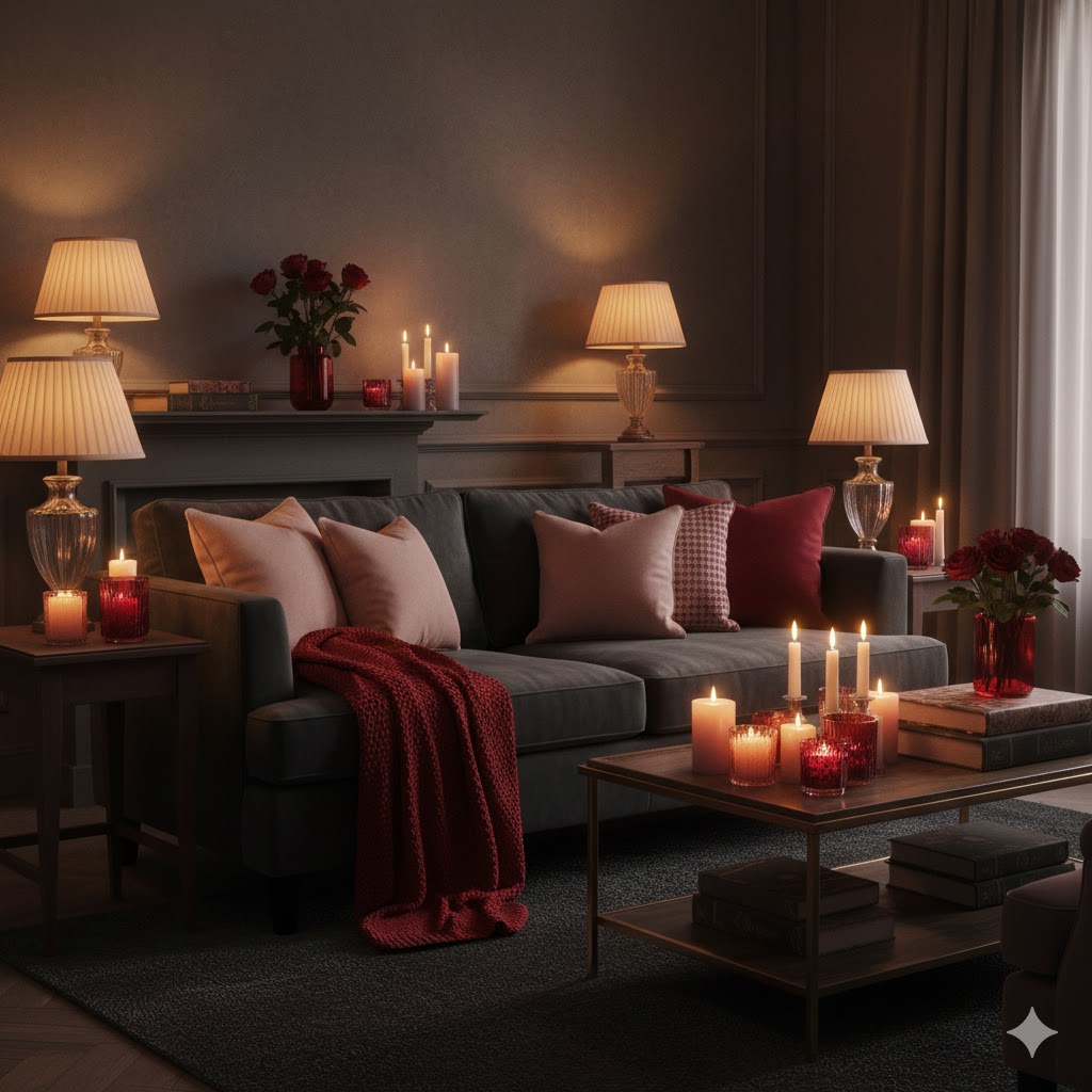
As your décor shifts from airy cherry blossom pastels to deeper cherry red tones, the emotional atmosphere of your home evolves too. This transition isn’t just about color — it’s about how those colors feel, especially as daylight softens and evenings grow longer.
Cherry blossom pink reflects light beautifully, creating an open, optimistic mood that suits spring mornings and sunlit afternoons. Cherry red, on the other hand, thrives in warmth. Under the right lighting, it feels romantic, enveloping, and deeply comforting rather than heavy.
How Lighting Elevates the Transition
Lighting is the key to making darker tones feel intentional and inviting:
- Swap cool white bulbs for warm or soft amber lighting to enhance red undertones.
- Introduce table and floor lamps with fabric, linen, or frosted glass shades to diffuse light gently.
- Style candle clusters in blush, ruby, or amber glass for an intimate glow.
- Use fairy lights or LED candles inside shelves or glass vases to soften bold accents.
Creating Emotional Balance
To maintain harmony as your palette deepens:
- Keep lighter cherry blossom accents visible — artwork, cushions, or ceramics — to prevent the space from feeling too dense.
- Pair cherry red décor with gold, brass, or warm wood tones to add elegance and visual warmth.
- Layer textures like velvet, boucle, and brushed cotton to make the space feel tactile and cozy.
When lighting and color work together, your home naturally transitions from fresh and playful to rich and soulful — perfect for late summer evenings, autumn nights, and cozy moments at home.
9. Styling With Nature: Florals, Branches & Seasonal Greens
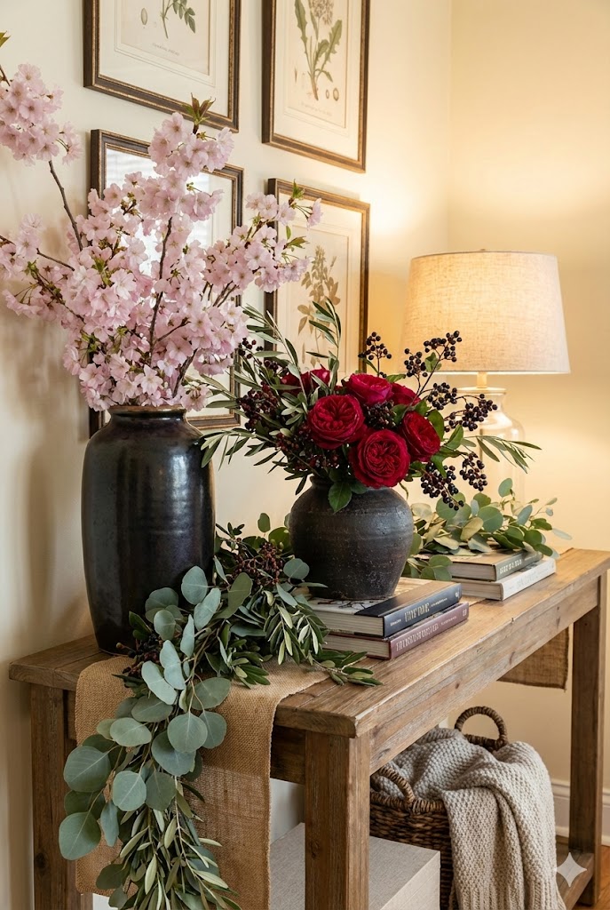
Nature is the easiest bridge between pastel spring décor and deeper seasonal tones.
Transitional floral ideas:
- Start with soft pink peonies or cherry blossoms
- Gradually introduce red roses, ranunculus, or dried florals
- Add branches, eucalyptus, or berry stems for contrast
- Use dark ceramic or glass vases to ground lighter florals
This evolution keeps your décor feeling organic and timeless, not forced or overly themed.
Conclusion: A Color Story That Grows With the Seasons
Transitioning from cherry blossom pastels to rich cherry red tones is more than a seasonal update — it’s a design story that reflects growth, warmth, and emotional comfort.
Rather than erasing spring’s softness, this approach builds upon it, allowing your home to mature naturally as the year progresses. The result is a space that feels cohesive, romantic, and thoughtfully styled — not rushed or trend-chasing.
By layering color, texture, lighting, and natural elements, you create a home that evolves with the seasons while still feeling unmistakably you.
Whether you’re drawn to delicate spring florals or deep, moody autumn tones, this palette transition lets you enjoy both — beautifully and effortlessly.
Related
- French Boudoir Inspired: Cherry Red Bedrooms with Parisian Elegance
- Dark Cherry Red Meets Boho: Eclectic Bedroom Ideas with a Sultry Edge
- Parisian Apartment Décor Ideas: Timeless, Chic and Effortlessly Stylish
- Summer Color Palettes That Feel Calm, Warm & Modern