Summer Color Palettes That Feel Calm, Warm & Modern
Summer is the perfect time to refresh your home with summer color palettes that feel light, inviting, and effortlessly stylish. The right summer color palettes can completely transform your space, making it feel brighter, calmer, and more connected to the season. Whether you love soft pastels, earthy neutrals, coastal tones, or vibrant citrus shades, these summer color palettes help create a home that feels both modern and relaxing. In this guide, you’ll discover the best summer color palettes for creating a fresh and aesthetic home this season.
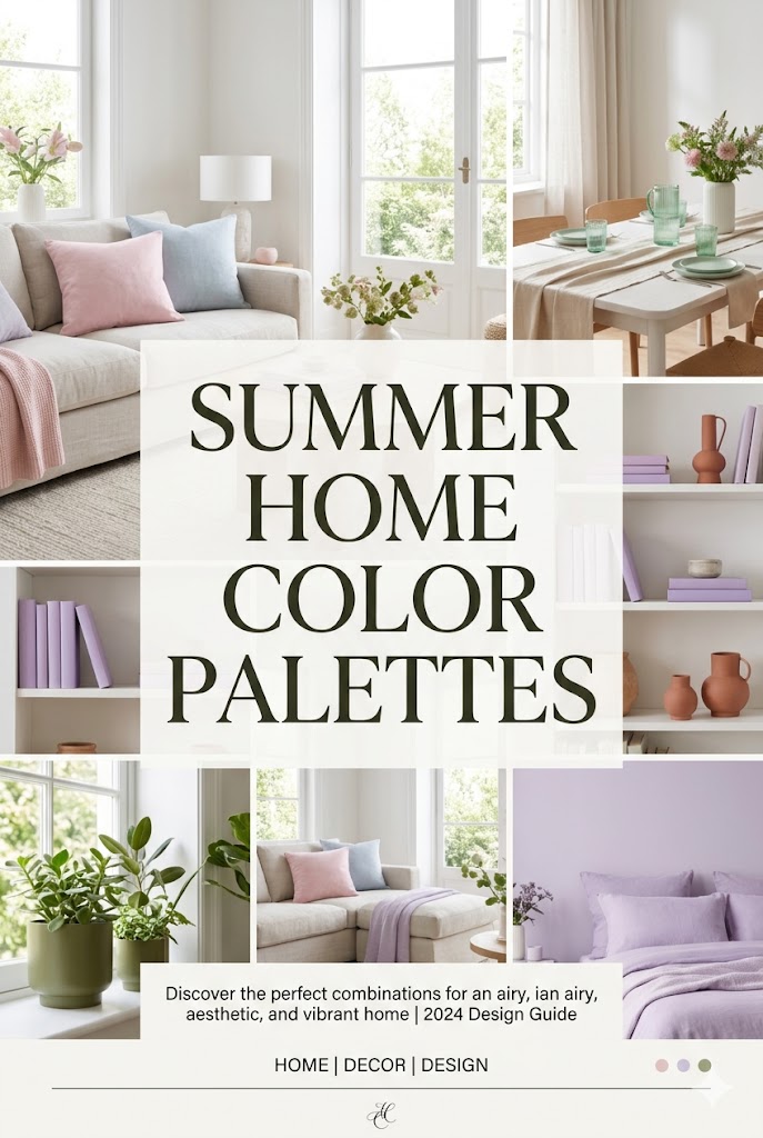
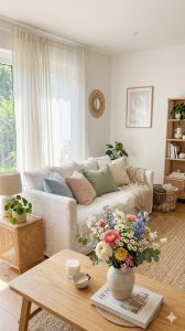
1. Soft Pastels for a Light & Dreamy Look
If you want your home to feel calm, fresh, and effortlessly aesthetic this summer, pastel color palettes are the way to go. Shades like blush pink, lavender, and mint green bring a soft, cooling effect that instantly makes any space feel brighter and more inviting.
Unlike bold summer colors, pastels create a gentle, airy atmosphere that works beautifully with natural light and minimal décor. They’re perfect for achieving that Pinterest-worthy, dreamy interior without overwhelming your space.
Perfect Pastel Color Combinations
🌷 Blush Pink + White + Beige
A soft and romantic palette that feels warm yet light. Blush pink adds a subtle glow, while white and beige keep the overall look clean and balanced.

💜 Lavender + Soft Grey + Cream
Lavender brings a calming, almost spa-like vibe to your home. Pairing it with muted neutrals like grey and cream creates a sophisticated and relaxing environment.

🌿 Mint Green + White + Light Wood
Mint green is refreshing and slightly cool-toned, making it perfect for hot summer days. Combined with white and natural wood textures, it creates a clean and organic feel.
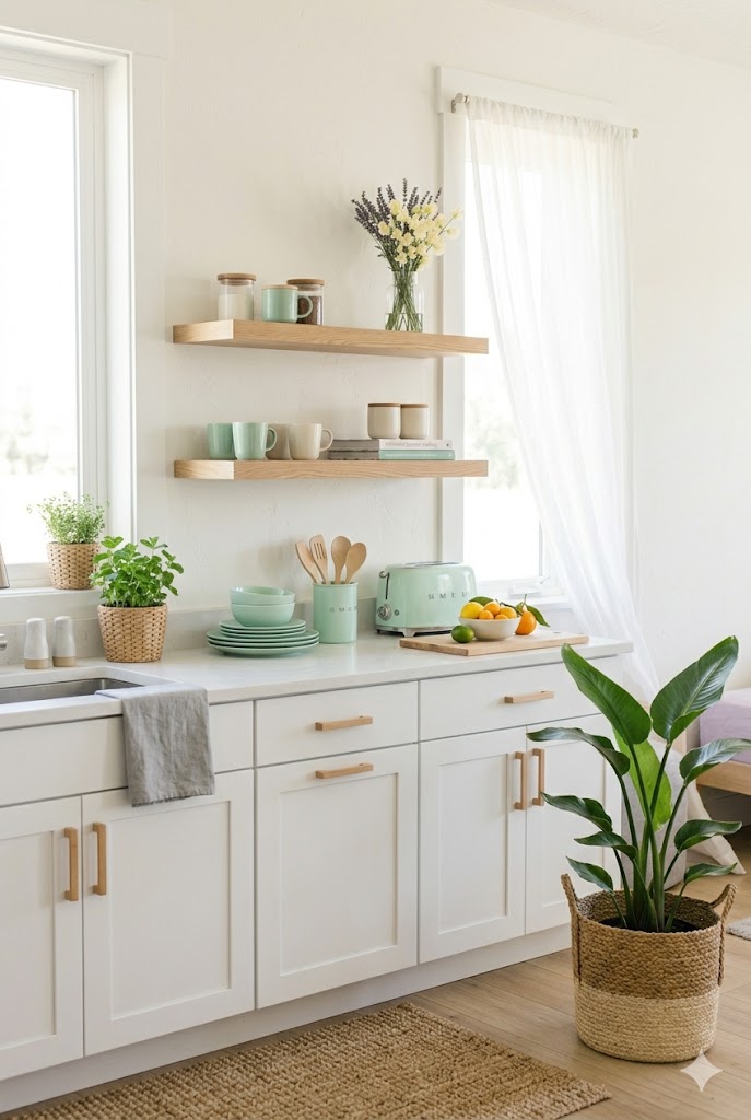
🍑 Peach + Ivory + Gold Accents
For a slightly warmer pastel look, peach tones add a soft glow. A touch of gold in décor pieces elevates the space while keeping it elegant.

How to Use Pastels Without Overdoing It
Pastel décor works best when it’s layered thoughtfully rather than used everywhere at once. Instead of painting entire rooms, try incorporating these shades through:
- Cushion covers and throws
- Wall art or prints
- Vases and decorative accents
- Bedding and curtains
Keeping your base neutral (white, beige, or light grey) allows pastel tones to stand out while maintaining a light and uncluttered look.
Styling Tip for a Summer Feel
Pair pastel colors with:
- Natural light
- Sheer fabrics
- Rattan or wooden textures
- Fresh flowers or greenery
This combination enhances the airy summer vibe and prevents the space from feeling too “sweet” or heavy.
2. Citrus Brights for a Fresh & Energetic Space
If pastels feel too soft for your style, citrus-inspired colors like lemon yellow, coral, and tangerine bring a lively, sun-kissed energy into your home. These shades instantly brighten any room and create a cheerful, welcoming atmosphere that feels like summer all day long.
Citrus tones are especially powerful because they reflect natural sunlight beautifully, making your space feel warmer, brighter, and more alive without needing major changes.
Perfect Citrus Color Combinations
🍋 Lemon Yellow + White + Light Wood
Lemon yellow adds a crisp, clean brightness that pairs beautifully with white walls and light wooden textures. This combination feels fresh, modern, and perfect for kitchens or small spaces.

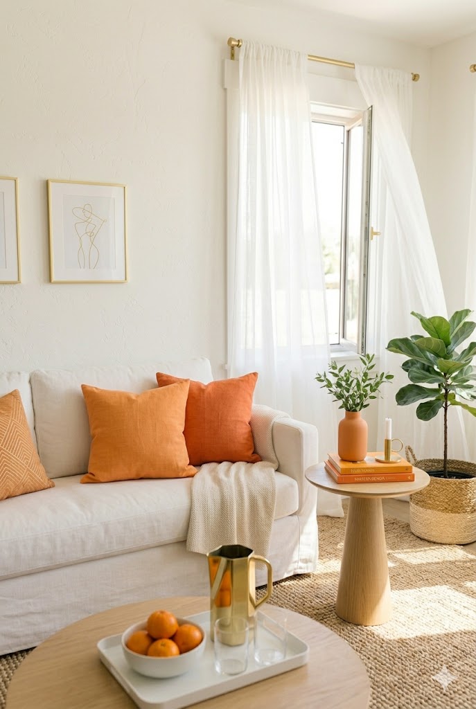
🍊 Tangerine + Beige + Gold Accents
Tangerine brings bold warmth, while beige softens the look to keep it balanced. A few gold accents—like trays or lighting—add a subtle touch of elegance without overpowering the space.
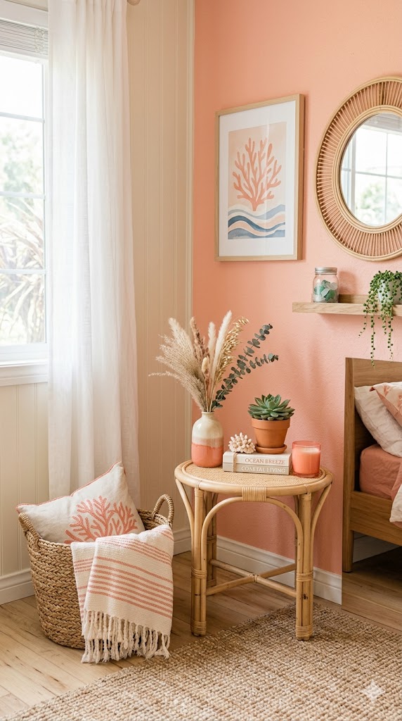
🌺 Coral + Cream + Natural Textures
Coral sits between pink and orange, making it vibrant yet soft enough for everyday styling. Pairing it with cream tones and woven textures creates a relaxed, beachy summer vibe.
🍹 Mixed Citrus Palette (Yellow + Coral + Tangerine)
Layering multiple citrus tones together creates a fun, playful aesthetic. Keep the base neutral and use these shades in small décor pieces to avoid visual clutter.

How to Style Citrus Colors Without Overwhelming Your Space
Bright colors can easily feel too bold if not balanced properly. The key is to use citrus shades as accent colors rather than the main base.
Try incorporating them through:
- Cushions and throws
- Table décor and centerpieces
- Artwork or prints
- Kitchen accessories (bowls, jars, linens)
Keeping your background neutral (white, beige, soft grey) allows these colors to pop while maintaining a clean and airy feel.
Styling Tip for a Fresh Summer Look
Pair citrus tones with:
- Natural sunlight
- White or light-colored furniture
- Green plants for contrast
- Glass or ceramic textures
This combination enhances the bright, refreshing summer aesthetic without making the space feel too intense.
3. Coastal Neutrals for a Calm & Breezy Look
If you love a soft, relaxing aesthetic, coastal neutrals are one of the best summer color palettes to bring into your home. Shades like beige, soft blue, and sandy tones create a light, airy atmosphere that feels effortlessly fresh—just like a quiet day by the sea.
This palette works beautifully because it reflects natural elements like sand, sky, and ocean, helping your space feel more open, peaceful, and connected to nature.
Perfect Coastal Summer Color Palettes
🏖️ Beige + White + Sandy Tones
This combination creates a warm and grounded base that feels clean yet cozy. Sandy tones add depth while keeping the overall look soft and natural, making it perfect for living rooms and bedrooms.

🌊 Soft Blue + White + Light Grey
Soft blue brings a cooling effect that instantly refreshes your space. Paired with crisp white and light grey, it creates a calm and airy coastal feel without looking too themed.
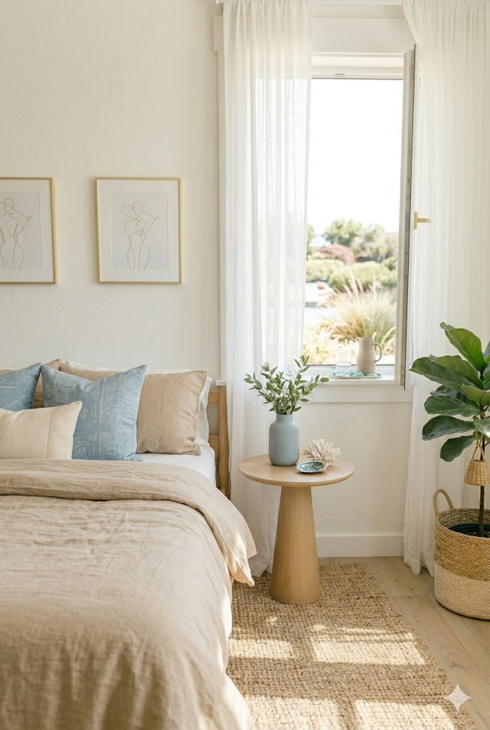
🌾 Sandy Beige + Driftwood Brown + Cream
Inspired by natural beach textures, this palette adds subtle contrast while staying neutral. It works especially well with wooden furniture and woven décor pieces.
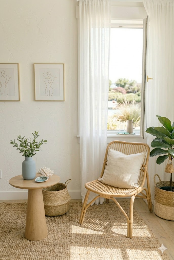
🐚 Blue + Beige + Natural Textures
Combining soft blue accents with beige tones and materials like rattan or linen creates a balanced, beach-inspired aesthetic that feels both relaxed and elegant.

How to Style Coastal Neutrals in Your Home
The beauty of coastal neutrals is their simplicity. Instead of bold contrasts, this style focuses on layering soft tones and textures to create depth.
You can easily incorporate this palette through:
- Linen curtains and light bedding
- Neutral rugs and cushions
- Wooden or rattan furniture
- Ceramic or glass décor pieces
Keep your layout open and uncluttered to enhance the airy, breezy effect.
Styling Tip for a True Coastal Feel
To bring this palette to life, focus on:
- Maximizing natural light
- Using sheer fabrics
- Adding subtle ocean-inspired décor (like shells or driftwood)
- Keeping the space minimal and breathable
This approach ensures your home feels fresh, calm, and effortlessly summer-ready.
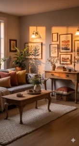
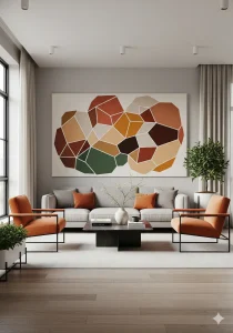
4. Earthy Neutrals for a Warm & Natural Vibe
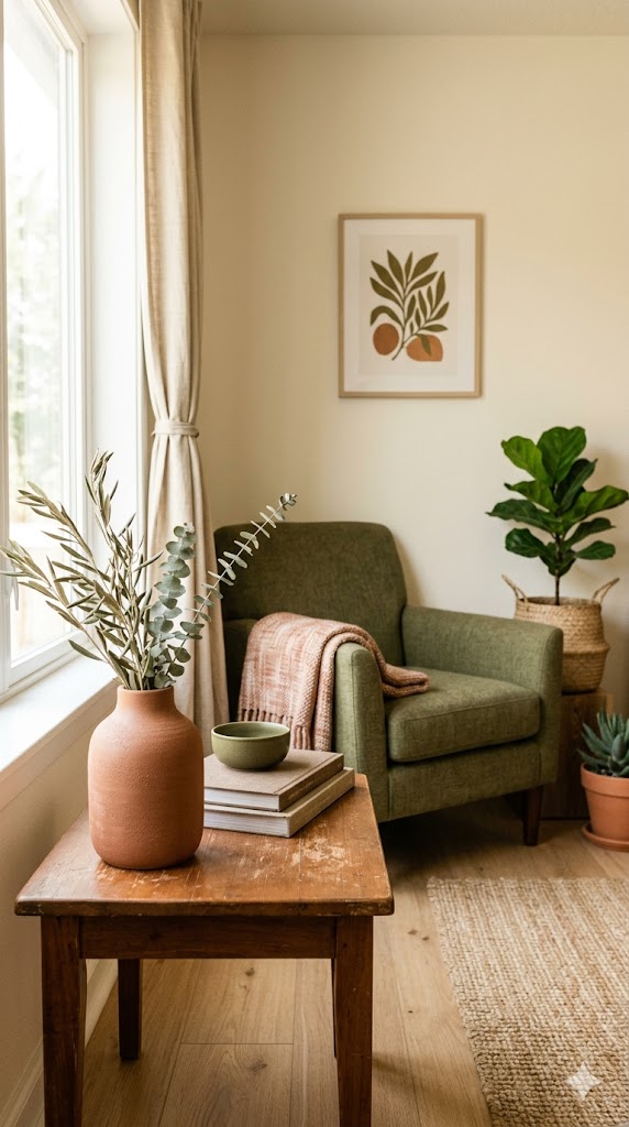
If you want your home to feel calm yet rich in character this summer, earthy neutrals are a beautiful choice. Shades like olive green, warm brown, and terracotta bring a grounded, nature-inspired look that feels both timeless and effortlessly stylish.
Unlike bright or pastel palettes, earthy tones create a soft, sun-warmed atmosphere that feels relaxing without being too minimal or too bold. They work especially well in homes that already feature wood, plants, or organic textures.
Earthy Neutral Summer Color Palettes
🌿 Olive Green + Beige + Light Wood
Olive green adds a subtle depth while still feeling fresh and natural. When paired with beige and light wood, it creates a soft, balanced look that feels calm and breathable.

🏺 Terracotta + Cream + Warm Brown
Terracotta brings warmth and a slightly rustic charm that instantly makes a space feel inviting. Combined with cream and warm brown tones, it creates a cozy yet refined summer aesthetic.
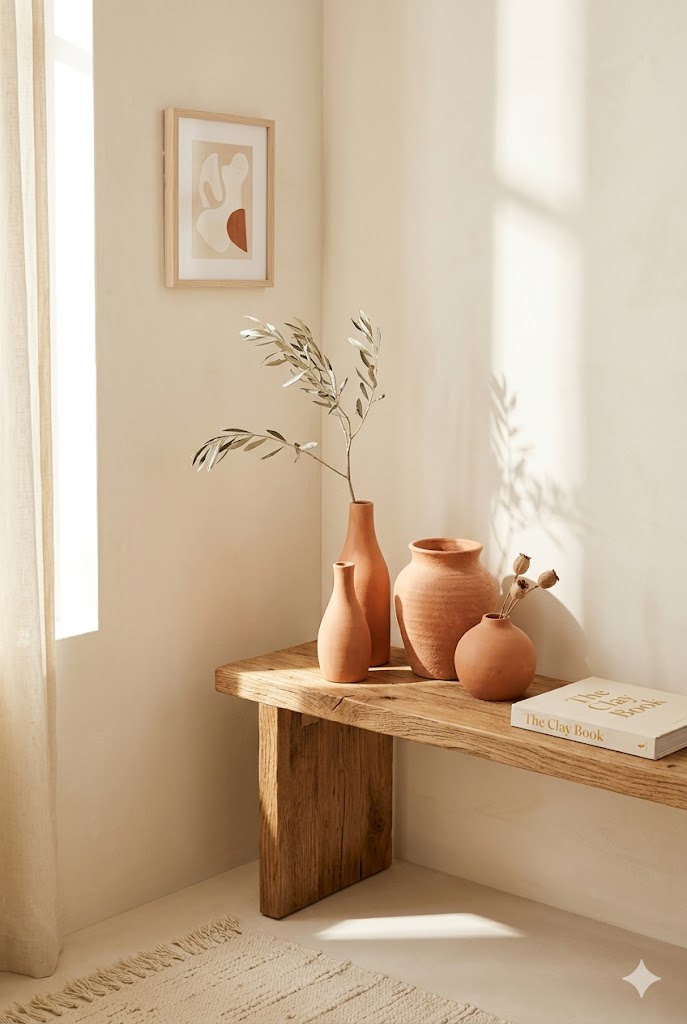
🌾 Warm Brown + White + Green Accents
This combination keeps things simple while adding richness through natural wood tones. Green accents like plants or olive-toned décor help keep the space feeling fresh and lively.
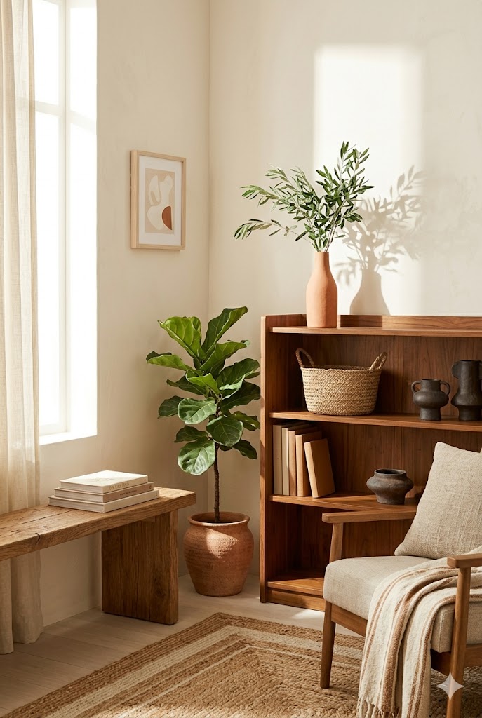
🌵 Earthy Mix (Olive + Terracotta + Brown)
Layering all three tones together creates a beautifully grounded palette. The key is to keep your base neutral and use these shades through textures and small décor elements.
How to Style Earthy Neutrals in Summer
Earthy tones can sometimes feel heavy, so the trick is to keep the styling light and breathable.
Use them through:
- Linen or cotton textiles in warm tones
- Clay or ceramic vases
- Wooden furniture and accents
- Indoor plants for a fresh contrast
Balance is key—pair deeper tones with lighter neutrals to maintain that summer feel.
Styling Tip for a Balanced Look
To keep earthy décor feeling summery:
- Let in plenty of natural light
- Mix textures like linen, wood, and clay
- Avoid overcrowding the space
- Add greenery to soften the look
This helps your home feel warm, grounded, and still fresh for the season.
Conclusion
Creating a summer-ready home doesn’t require a complete makeover—sometimes, the right color palette is all it takes. Whether you’re drawn to soft and dreamy pastels, vibrant citrus tones, calming coastal hues, or rich earthy neutrals, each palette brings its own unique mood and personality. The key is to keep your space light, balanced, and connected to natural elements. With a few thoughtful updates, you can turn your home into a calm, warm, and modern summer retreat that feels fresh all season long.
Related
- Summer Home Decor Ideas: The Ultimate Guide to a Fresh, Light & Aesthetic Home
- The Ultimate Guide to Color Psychology in Interior Design
- 15 Earth Tone Color Palettes for a Cozy & Stylish Home
- The Ultimate Cottage Color Palette Guide for a Cozy & Inviting Home