The Ultimate Guide to Color Psychology in Interior Design
Color is one of the most powerful tools in interior design. Beyond its aesthetic appeal, color can dramatically influence our emotions, behaviors, and even our productivity. This is the essence of color psychology in interior design—a concept that helps homeowners, decorators, and designers choose hues that not only look beautiful but also create the right atmosphere for each room.
In this ultimate guide, we’ll explore how different colors affect mood, how to use them effectively in your home, and the best combinations for creating balance and harmony. Whether you’re planning a complete remodel or just refreshing a single room, understanding color psychology for interiors will elevate your design choices.
What Is Color Psychology in Interior Design?
Color psychology is the study of how colors influence human emotions and behaviors. In the world of interior design, it refers to how wall paint, furniture finishes, textiles, and decorative accents affect the overall feel of a space. The right color scheme can make a small room feel bigger, a large room feel cozier, or a dull space feel vibrant and lively.
When used thoughtfully, color in interior design becomes more than decoration—it becomes a way to create mood, establish function, and tell a story about your personal style.
The Power of Warm Colors
Red: Energy and Passion
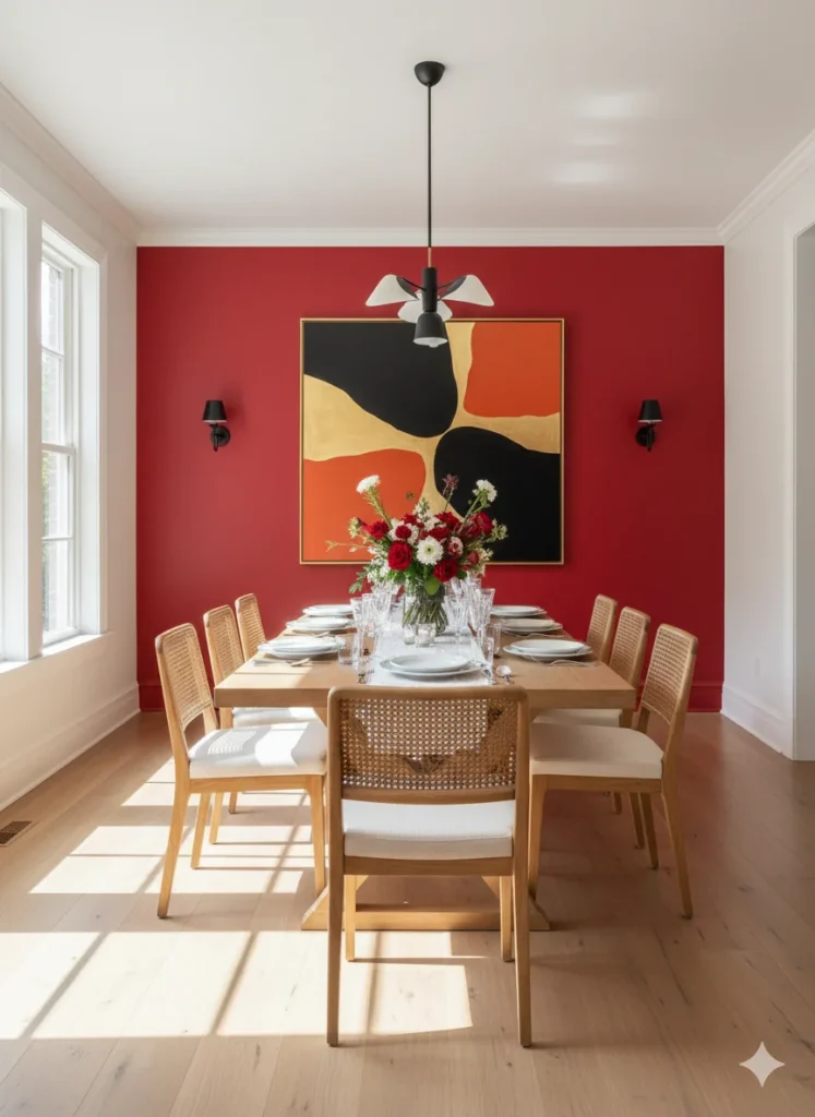
Red is a bold, stimulating color that evokes excitement, passion, and warmth. In interior design, it’s often used in dining rooms and kitchens because it can increase appetite and spark lively conversations. However, too much red can feel overwhelming, so it’s best used as an accent wall, in throw pillows, or through décor details.
You may also like: French Boudoir Inspired: Cherry Red Bedrooms with Parisian Elegance
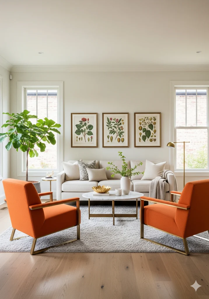
Orange: Creativity and Sociability
Orange is associated with creativity, fun, and enthusiasm. It works beautifully in spaces where people gather, such as living rooms or playrooms. Paired with neutral tones, orange adds a pop of vibrancy without overpowering the room.
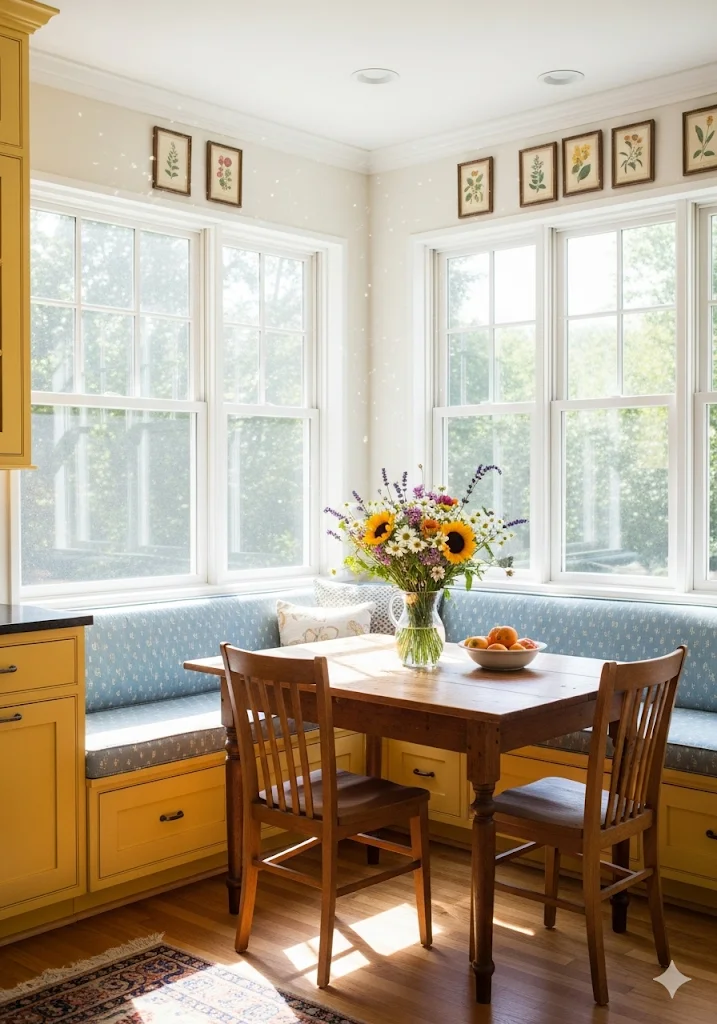
Yellow: Optimism and Happiness
Yellow symbolizes sunshine, positivity, and cheer. It’s a wonderful choice for kitchens, breakfast nooks, or home offices, where you want to promote motivation and happiness. Muted yellows and mustard tones are especially trending in modern interior design color palettes.
You may also like: Yellow Aesthetic Room Ideas for a Bold Personality
18 Inspiring Breakfast Nook Ideas for a Cozy and Stylish Home
The Calmness of Cool Colors
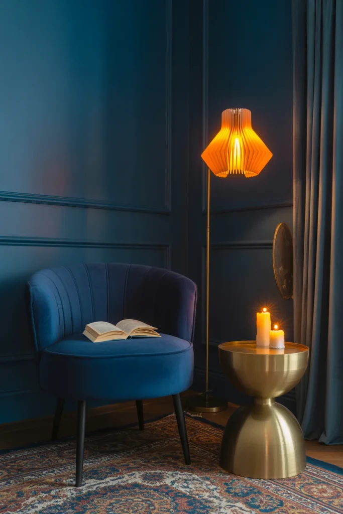
Blue: Serenity and Focus
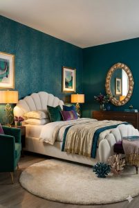
Blue is one of the most popular colors in home interiors because of its calming effect. Light blues create a peaceful, airy vibe—perfect for bedrooms and bathrooms. Darker blues like navy add sophistication, often used in dining rooms, libraries, or office spaces to promote focus and productivity.
You may also like: Where Shadows Glow: Moody Corners That Feel Like Home
Moody Bedroom Ideas: Paint Colors, Aesthetic & Décor Inspiration
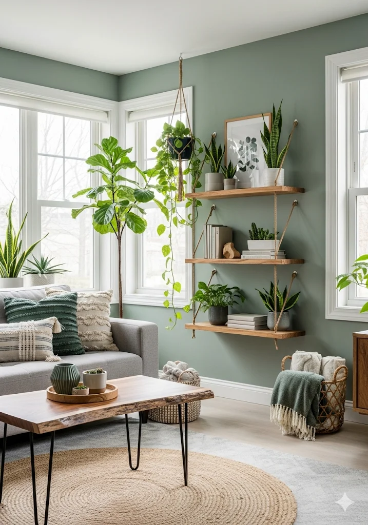
Green: Balance and Renewal
Green is the color of nature, symbolizing growth, freshness, and harmony. It’s versatile in design—sage greens bring a soft, organic touch, while emerald greens make a bold statement. Green is an ideal choice for living rooms and bedrooms, where relaxation and balance are key.
You may also like: Sage Green Bedroom Ideas: Calm, Earthy, and On-Trend
How to Create a Cozy Biophilic Corner with Indoor Plants
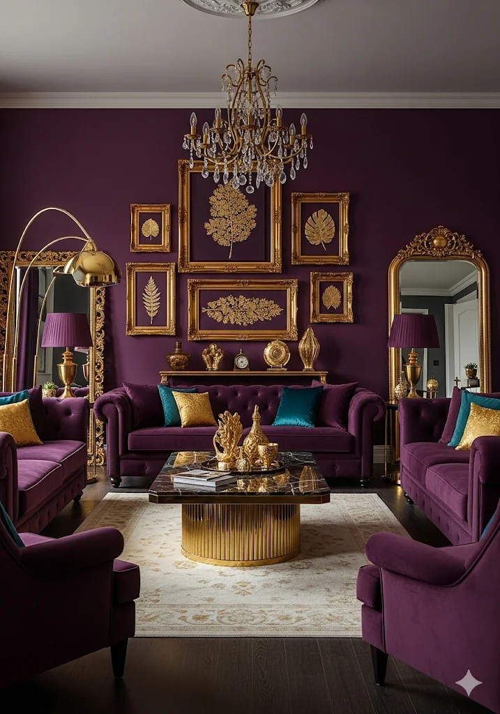
Purple: Luxury and Creativity
Historically linked to royalty, purple exudes luxury, drama, and imagination. Soft lavenders bring a soothing feel, while deep plums add richness to a space. It works well in bedrooms, reading nooks, or as accent décor in modern homes.
You may also like: The Psychology of Color in Eclectic Maximalist Interiors
Neutrals: The Foundation of Interior Design
Neutral colors such as white, beige, gray, and taupe are timeless staples in interior color design. They provide a versatile backdrop that allows bold accent colors to shine.
- White symbolizes purity and simplicity, often used in minimalistic or Scandinavian designs.
- Gray adds elegance and can feel either cool or warm depending on undertones.
- Beige and taupe create warmth and coziness, perfect for traditional or rustic interiors.
Layering neutrals with textures—such as natural wood, linen, or stone—adds depth and prevents spaces from feeling flat.
How to Use Color Psychology in Different Rooms
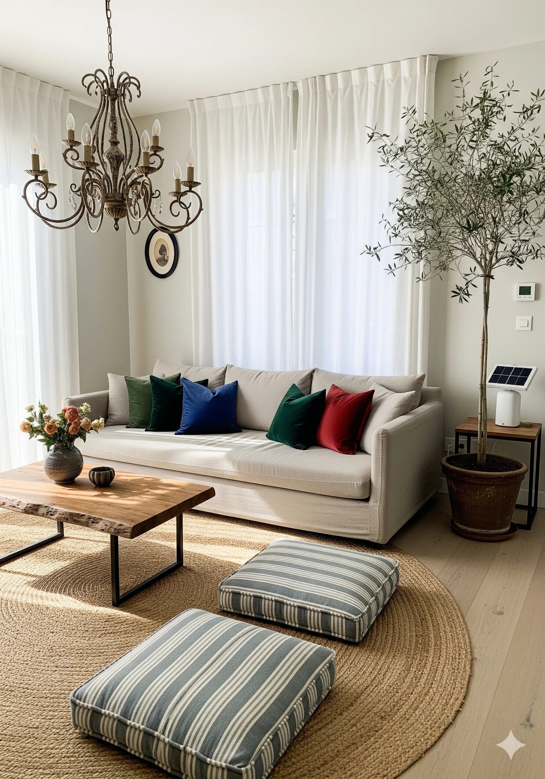
Living Room
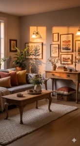
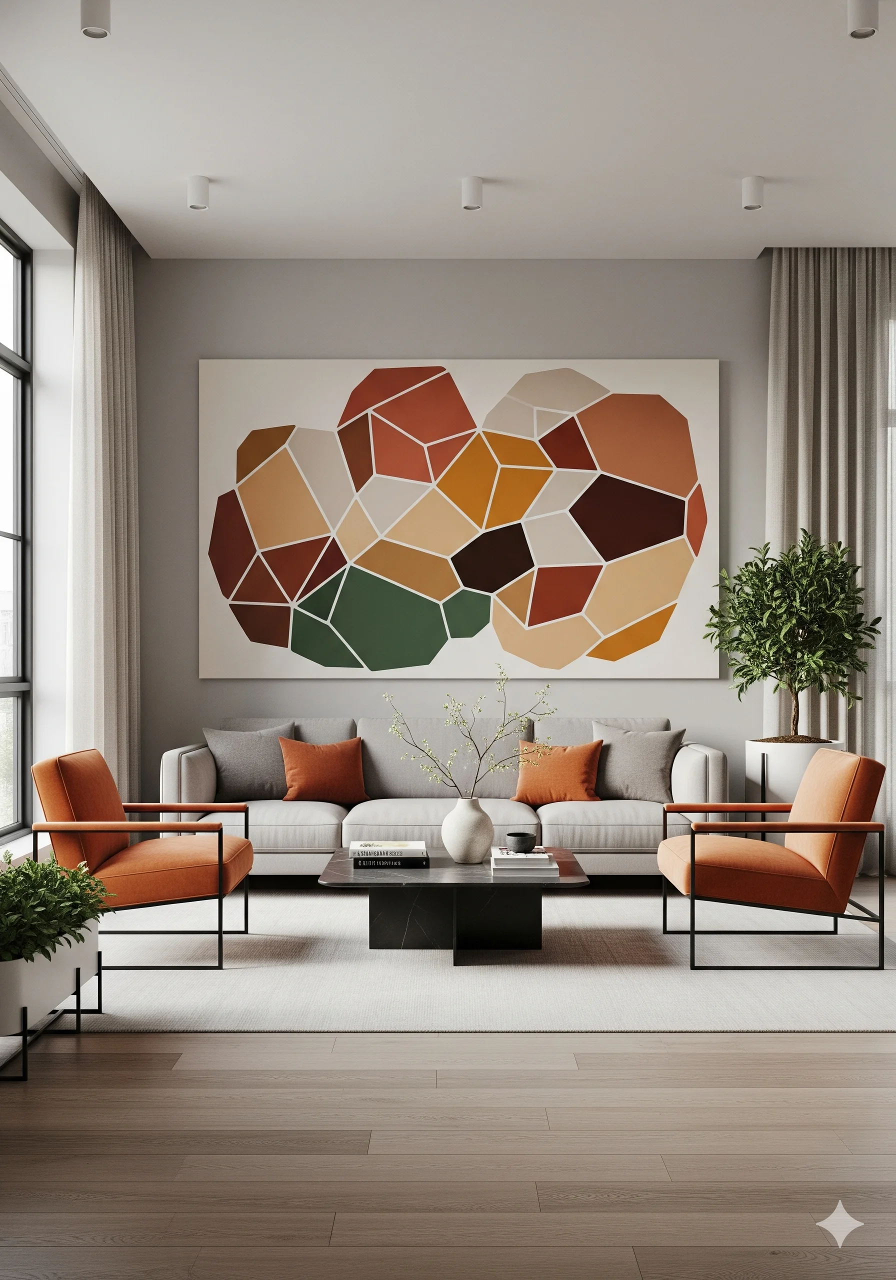
The living room is the heart of the home, where family and guests gather. Warm tones like beige, earthy greens, or muted yellows create a welcoming environment. For a more modern look, pair neutrals with bold accent chairs or statement artwork in vibrant hues.
Discover more ideas → 20 Earthy Neutral Palettes for a Cozy Modern Farmhouse Living Room
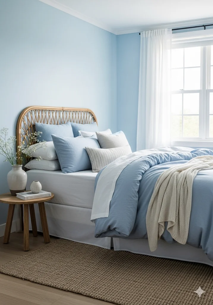
Bedroom
The bedroom should promote relaxation and rest. Cool colors like soft blue, sage green, and lavender encourage calmness. Avoid overly stimulating shades like bright red or orange in this space.
You may also like: 10 Charming Hamptons Style Beach Cottage Ideas
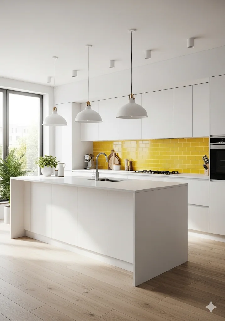
Kitchen and Dining Area
These are social, energetic spaces where warm colors shine. Shades of yellow and orange can stimulate appetite, while accents of red create a lively dining atmosphere. For a sleek modern kitchen, combine white cabinetry with bold pops of color through backsplashes or bar stools.
Discover more ideas → 20 Beautiful Farmhouse Kitchen Color Scheme Ideas to Inspire You
Bathroom
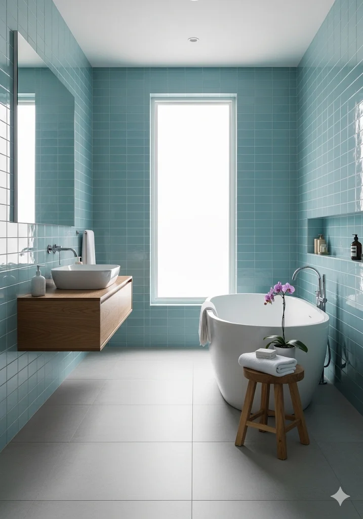
Bathrooms benefit from soothing tones like aqua blue, mint green, or crisp white, which evoke cleanliness and freshness. Adding natural textures like wood or stone enhances the spa-like vibe.
Home Office
Productivity is key in a home office. Blue shades improve focus and efficiency, while touches of green promote balance. If you need creative energy, consider orange or yellow accents.

You may also like: The Ultimate Guide to Home Libraries: Reading Nooks, Bookshelf Styling & Lighting
Tips for Choosing the Right Color Palette
- Consider Natural Light – Rooms with lots of sunlight can handle deeper hues, while dimly lit rooms benefit from lighter shades.
- Balance Warm and Cool Tones – Too much of one can make a space feel unbalanced.
- Use Accent Colors – Introduce bold colors through pillows, rugs, or artwork instead of painting an entire wall.
- Think About Room Function – Match color psychology with how you want the room to feel and be used.
- Test Before Committing – Always paint swatches and observe them throughout the day under different lighting.
Trending Interior Design Color Palettes
For 2025, trending palettes include earthy neutrals, sage and olive greens, soft terracottas, and bold navy blues. These shades reflect a growing preference for biophilic design, bringing natural elements indoors. Pairing muted tones with pops of vibrant colors is also a popular choice for creating modern yet timeless spaces.
Final Thoughts: Color Psychology in Interior Design
Understanding color psychology in interior design allows you to create spaces that not only look beautiful but also support your lifestyle and well-being. From energizing reds to calming blues, every shade has the power to transform the atmosphere of your home. By thoughtfully selecting your color palette, you can design a space that feels harmonious, functional, and uniquely yours.
Related
- 10 Home Design Trends You’ll See Everywhere in 2025
- The Ultimate Cottage Color Palette Guide for a Cozy & Inviting Home
- 20 Earthy Neutral Palettes for a Cozy Modern Farmhouse Living Room
- Dark Neutrals: The Rise of Graphite Walls and Textured Finishes
- Summer Color Palettes That Feel Calm, Warm & Modern