15 Earth Tone Color Palettes for a Cozy & Stylish Home
Introduction
Earth tones can make a home feel warmer, calmer, and more connected to nature, but choosing the right combination isn’t always as simple as picking a few shades of brown and green.
The key is finding a balance between the colors, the amount of natural light in the room, your existing furniture, and the mood you want to create.
Some earthy palettes feel light and airy, while others are rich and dramatic. A terracotta-and-sand combination can make a room feel warm and relaxed, while forest green and walnut create a deeper, more sophisticated atmosphere.
Below are 15 earth tone color palettes, along with practical ways to decide where each combination works best and how to use it without making your home feel flat or overly brown.
Table of Contents
15 Beautiful Earth Tone Color Palettes
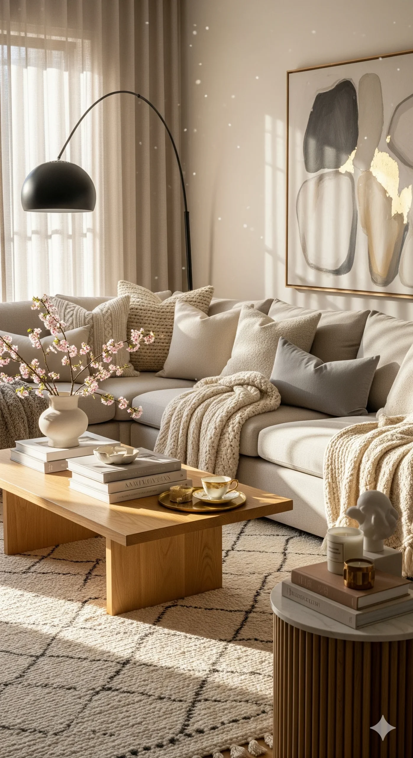
1. Warm Beige & Cream Comfort
Warm beige and cream are an easy starting point if you want an earthy home that still feels bright.
Beige works well as the main color while cream keeps the room from looking too heavy. Add light or medium-toned wood for another natural layer.
Best for: Living rooms, bedrooms, entryways
Mood: Soft, warm, relaxed
Works beautifully with: Oak, rattan, linen, light wood
Choose this palette if: You want a neutral room that feels warmer than a traditional white interior.
If your room gets plenty of sunlight, you can introduce a slightly deeper caramel or walnut accent. In a darker room, keep the beige relatively light and use cream on larger surfaces.
2. Terracotta & Sandstone
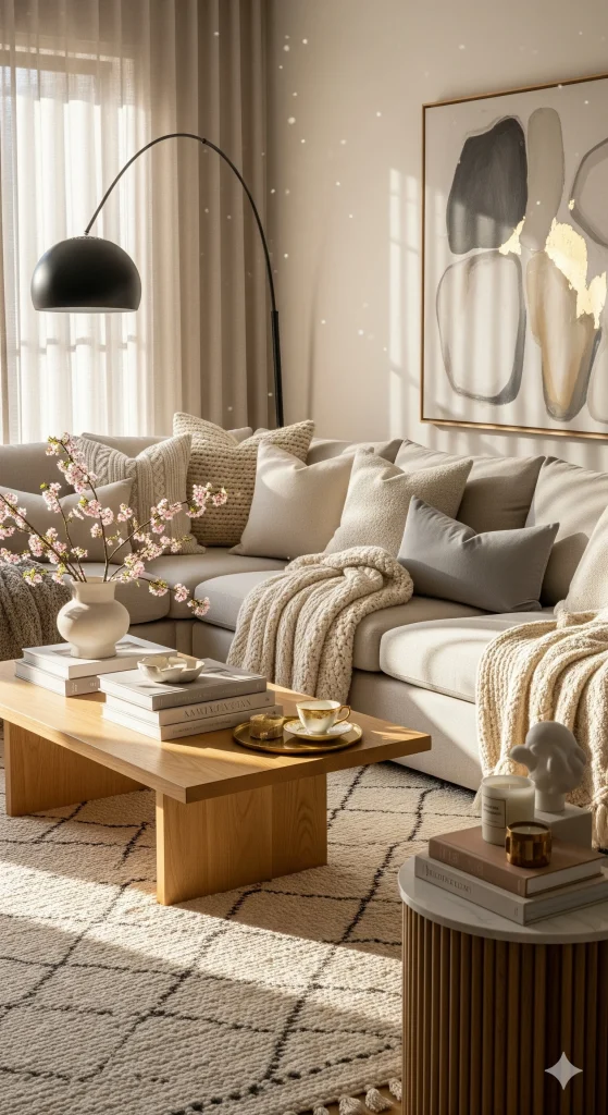
Terracotta is one of the easiest earthy colors to recognize because it resembles natural clay and fired pottery.
Pairing it with sandy beige softens its intensity and creates a warm, sun-baked feeling without overwhelming the room.
Best for: Living rooms, dining rooms, patios, kitchens
Mood: Warm, relaxed, Mediterranean-inspired
Works beautifully with: Cream, natural wood, olive green, woven textures
Choose this palette if: You want more personality than a neutral palette provides.
You don’t necessarily need a terracotta wall. A terracotta sofa, rug, cushions, pottery, or artwork can provide enough color.
3. Sage Green & Natural Linen
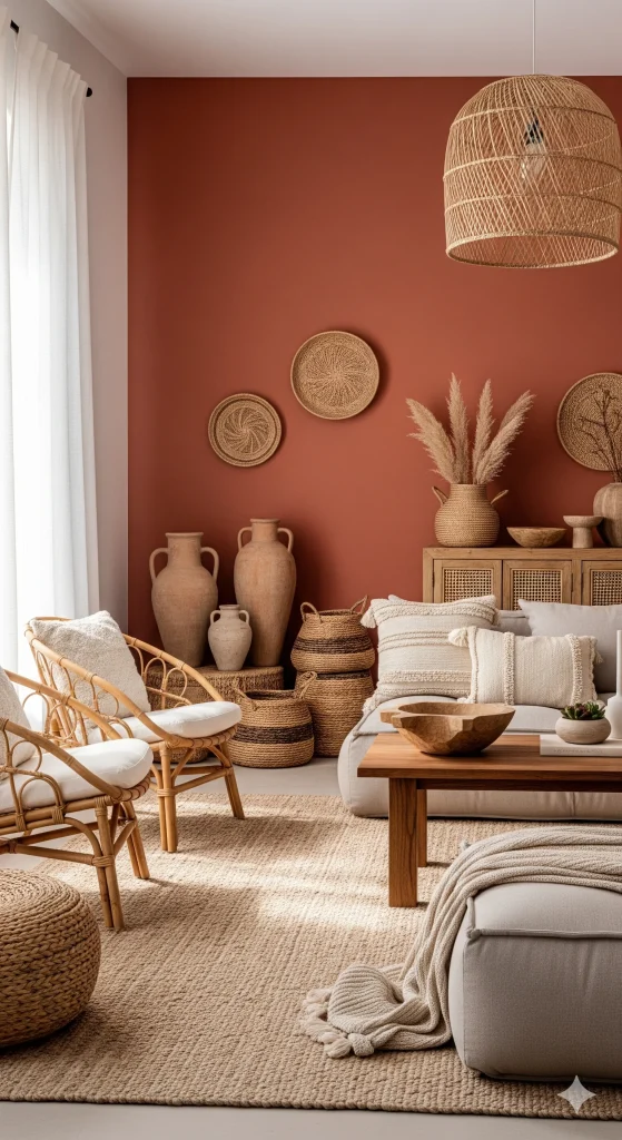
Sage green is particularly useful when you want to introduce color without creating a strong contrast.
Combined with natural linen and pale wood, it creates a soft, organic look that works especially well in bedrooms.
Best for: Bedrooms, reading corners, bathrooms
Mood: Calm and refreshing
Works beautifully with: Linen, oak, rattan, warm white
Choose this palette if: You like green but don’t want a bold or saturated interior.
For a cohesive room, repeat sage in two or three smaller elements rather than using it everywhere.
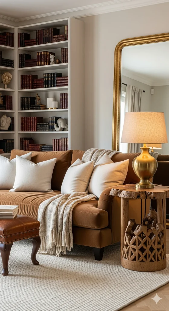
4. Caramel Brown & Ivory
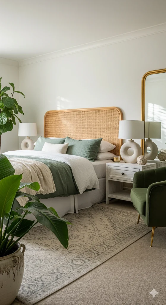
Caramel adds warmth and richness, while ivory keeps the combination light enough for everyday living.
This palette is particularly effective when you want your home to feel cozy without relying on dark walls.
Best for: Living rooms, bedrooms, home offices
Mood: Comfortable and elegant
Works beautifully with: Leather, walnut, cream, brass
Choose this palette if: You love warm interiors but don’t want a rustic look.
A caramel-colored chair or sofa can become the focal point while ivory walls, curtains, or rugs balance the stronger tone.
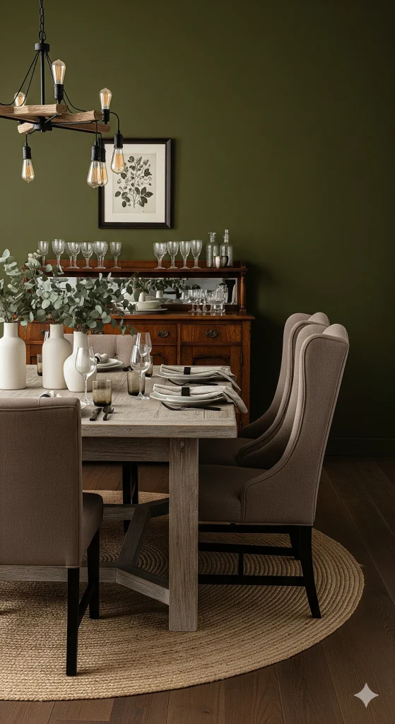
5. Olive Green & Taupe
Olive green has a more muted and sophisticated quality than brighter greens. Taupe gives it a neutral foundation without making the room feel cold.
Best for: Dining rooms, living rooms, kitchens
Mood: Sophisticated and grounded
Works beautifully with: Dark wood, aged brass, jute, cream
Choose this palette if: You want an earthy interior with a slightly more grown-up feel.
This is also a good choice for rooms where you want color but don’t want the color to dominate.
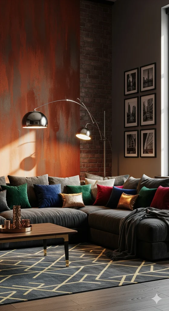
6. Rust & Charcoal
Rust and charcoal create a stronger contrast than many of the lighter palettes on this list.
Rust brings warmth, while charcoal adds depth and definition.
Best for: Dining rooms, offices, living rooms
Mood: Moody, dramatic, sophisticated
Works beautifully with: Black metal, dark wood, leather, warm white
Choose this palette if: You prefer a darker, more dramatic interior.
Use charcoal carefully in small rooms. Keeping the ceiling and larger surfaces lighter can prevent the space from feeling enclosed.
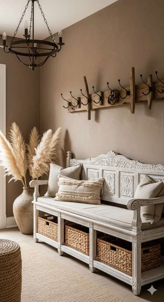
7. Clay & Whitewashed Wood
Clay tones work beautifully with pale, weathered wood because the warm color gains a lighter visual partner.
This combination is particularly effective in rustic, farmhouse, coastal-rustic, and relaxed bohemian interiors.
Best for: Entryways, bedrooms, kitchens
Mood: Casual and welcoming
Works beautifully with: Woven baskets, linen, handmade ceramics
Choose this palette if: You like rustic character but don’t want a heavy brown interior.
Use clay on one wall or through accessories rather than covering every surface in the color.
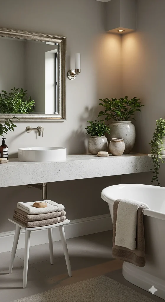
8. Warm Gray & Stone
Not every earthy palette needs to be warm brown or terracotta. Stone-inspired gray can also create a natural feeling, especially when it has warm rather than blue undertones.
Best for: Bathrooms, kitchens, minimalist living rooms
Mood: Calm and understated
Works beautifully with: Limestone, travertine, oak, cream
Choose this palette if: You prefer a quieter, more modern interpretation of earthy décor.
The important detail here is undertone. A cool blue-gray can create a completely different atmosphere from a warm stone gray.
9. Mustard Yellow & Mocha
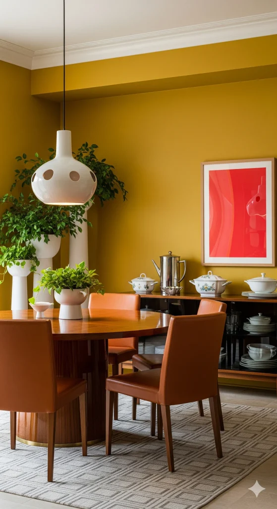
Mustard yellow adds energy while mocha brown provides a grounding base.
This combination works particularly well when you want an earthy interior that doesn’t feel overly neutral.
Best for: Kitchens, dining rooms, breakfast nooks
Mood: Cheerful and warm
Works beautifully with: Walnut, cream, terracotta, aged brass
Choose this palette if: You want warmth with a noticeable pop of color.
You don’t need much mustard. A pendant light, dining chairs, artwork, or cushions can be enough.
10. Copper & Slate
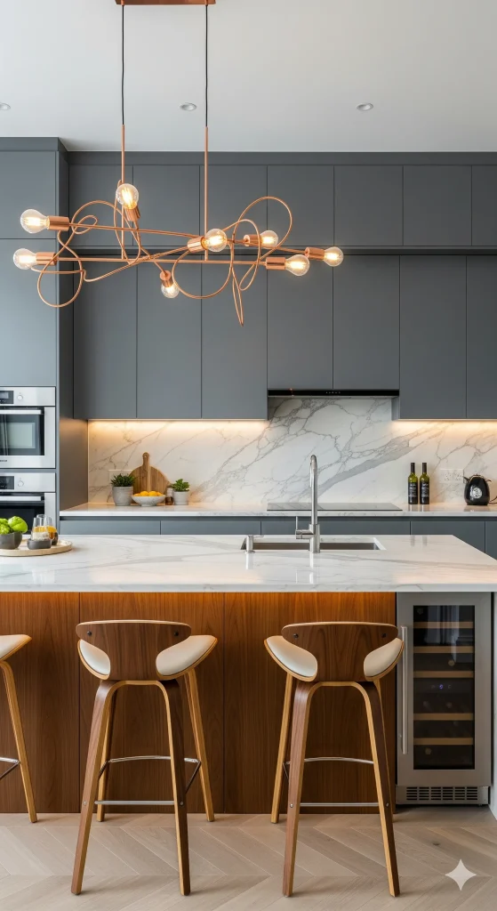
Copper and slate create a sophisticated combination with a slightly industrial character.
Copper introduces warmth and metallic shine, while slate provides a darker foundation.
Best for: Kitchens, bathrooms, home bars
Mood: Modern and polished
Works beautifully with: Wood, marble, warm white, black accents
Choose this palette if: You like earthy colors but want your space to feel more contemporary.
Keep the metallic accents controlled. A few copper details usually look more refined than using copper on every surface.
11. Forest Green & Deep Walnut
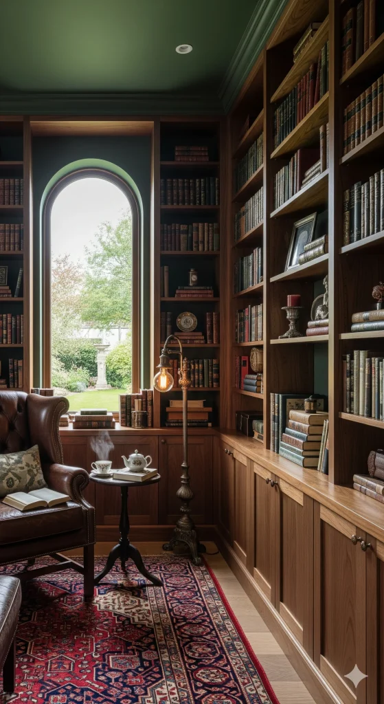
If you love dark, cozy interiors, forest green and walnut are worth considering.
The combination feels rich because both colors have depth, but the green prevents the room from becoming entirely brown.
Best for: Libraries, offices, bedrooms, cozy living rooms
Mood: Moody, luxurious, intimate
Works beautifully with: Leather, brass, cream, textured fabrics
Choose this palette if: You want a dramatic room with a strong connection to nature.
In a small or poorly lit room, use forest green selectively and introduce cream or warm white to create breathing space.
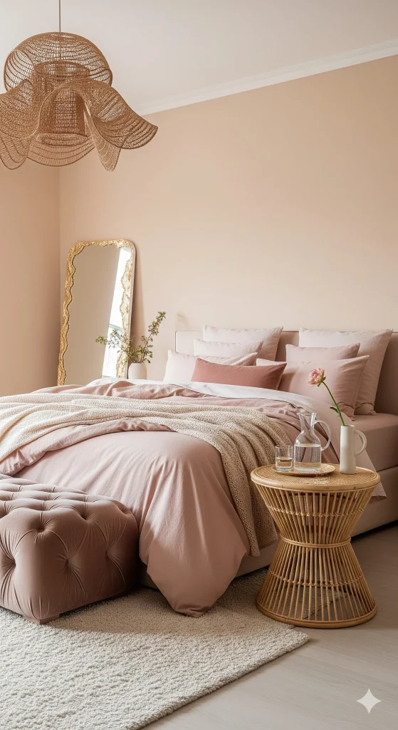
12. Soft Peach & Clay Pink
Earthy interiors don’t have to be masculine or dark. Soft peach and muted clay pink create a warmer, gentler interpretation of natural colors.
Best for: Bedrooms, dressing areas, nurseries
Mood: Soft, warm, welcoming
Works beautifully with: Cream, light oak, natural linen, muted terracotta
Choose this palette if: You want an earthy room that feels light and delicate.
Look for dusty or muted versions rather than highly saturated pinks if you want to maintain the natural feel.
13. Burnt Orange & Sand
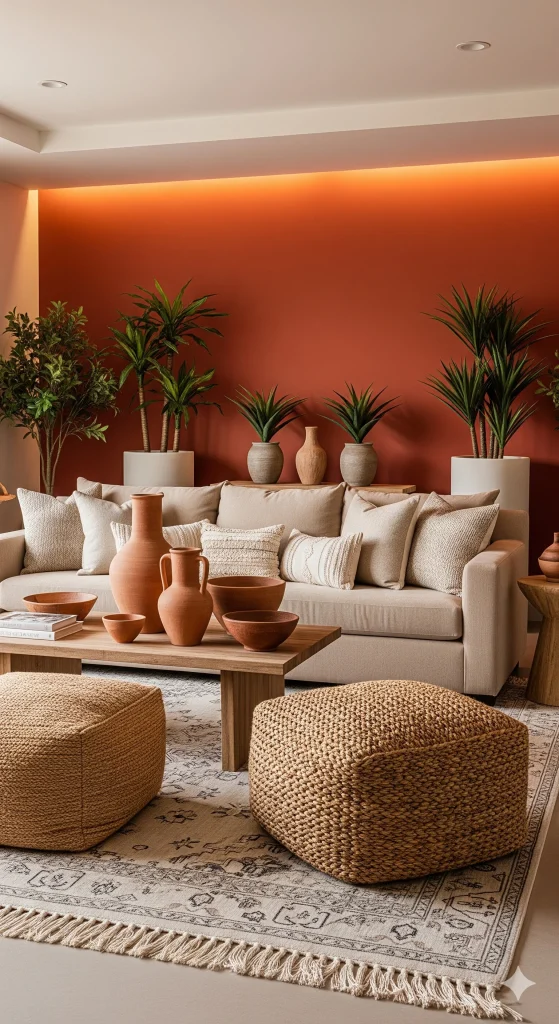
Burnt orange has a stronger personality than terracotta, but pairing it with sand keeps the combination balanced.
This palette works particularly well when you want your room to have a warm, desert-inspired character.
Best for: Living rooms, dining areas, sunrooms
Mood: Warm, sunny, relaxed
Works beautifully with: Beige, cream, leather, natural fibers
Choose this palette if: You want an earthy room with more visual energy.
Use burnt orange as an accent rather than the dominant color unless the room has plenty of natural light.
14. Khaki Green & Warm White
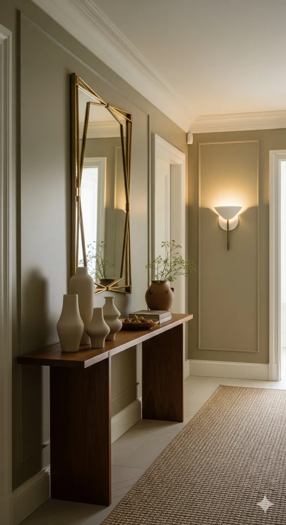
Khaki green is understated enough to work almost like a neutral.
Combined with warm white, it creates a fresh earthy look without the stronger contrast of forest or olive green.
Best for: Hallways, kitchens, bedrooms, living rooms
Mood: Fresh, relaxed, understated
Works beautifully with: Natural oak, linen, woven textures, aged brass
Choose this palette if: You want to introduce green while keeping the overall room light.
This is one of the more flexible choices because both colors can be used across large surfaces without becoming overwhelming.
15. Chocolate Brown & Soft Gray
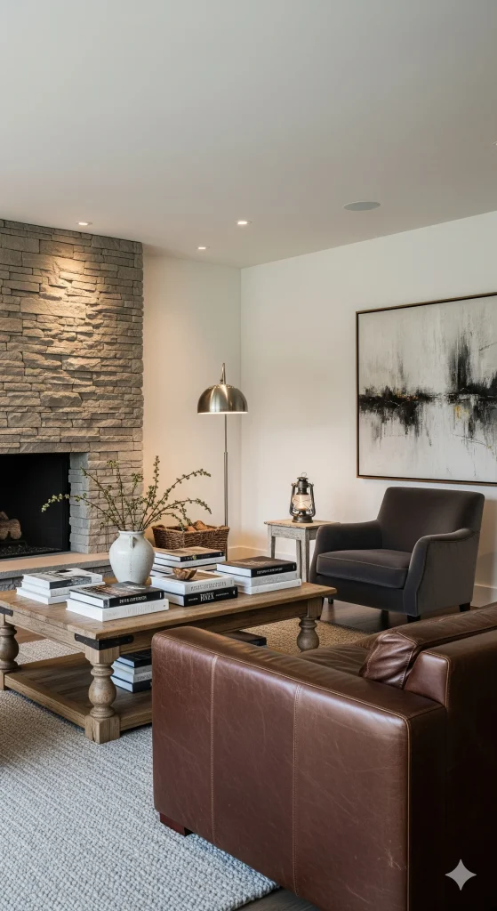
Chocolate brown brings depth and coziness, while warm soft gray prevents the palette from becoming too rich.
The result can feel sophisticated rather than rustic when paired with clean-lined furniture.
Best for: Living rooms, bedrooms, offices
Mood: Cozy, sophisticated, timeless
Works beautifully with: Leather, stone, walnut, ivory
Choose this palette if: You love dark earthy colors but want some visual balance.
If your room is small, consider using chocolate brown through furniture and accessories instead of painting all four walls.
How to Style Earth Tone Color Palettes
- Use textures: Layer wood, linen, leather, clay, and rattan for depth in your earth tone interior design.
- Balance light & dark: Mix deeper tones (forest green, rust, chocolate) with airy neutrals (ivory, cream, beige) to create warm earthy tones that feel balanced.
- Bring nature inside: Add plants, natural stones, and woven textiles for a truly nature-inspired home décor approach.
- Highlight with lighting: Warm bulbs enhance the cozy mood of these natural color schemes.
Why Earth Tone Color Palettes Are So Popular
One reason earth tone color palettes continue to trend is their timeless appeal. Unlike bright colors that come and go with seasonal trends, earthy hues remain stylish year after year. Inspired by nature, these shades create a sense of comfort, balance, and connection to the outdoors.
Another advantage is versatility. Earth tones work beautifully in modern, farmhouse, boho, Scandinavian, rustic, and even traditional interiors. Whether you’re decorating a small apartment or a spacious home, these natural color schemes can adapt to almost any design style.
Homeowners also love earth tones because they make rooms feel warm and welcoming. Colors like terracotta, sage green, caramel brown, and sandy beige create a cozy atmosphere that’s perfect for relaxing, entertaining, and everyday living.
How to Choose the Right Earth Tone Color Palette
With so many beautiful options available, selecting the perfect palette can feel overwhelming. Here are a few tips to help you narrow down your choices:
If you’re stuck between several combinations, don’t choose based on the colors alone. Look at the room you’re actually decorating.
For a bright room: You have more freedom to experiment with rust, forest green, chocolate, and charcoal.
For a dark room: Start with cream, warm beige, soft taupe, sage, or khaki and introduce darker colors through accents.
For a small room: Lighter combinations usually make the space feel more open. Use deeper earthy colors selectively.
For a cozy bedroom: Sage and linen, caramel and ivory, Soft peach and clay pink, or forest green and walnut are particularly effective.
For a modern home: Try warm gray and stone, copper and slate, or olive and taupe.
For a relaxed rustic home: Terracotta and sand, clay and whitewashed wood, or burnt orange and sand are natural choices.
For Kitchens: Mustard yellow and mocha, Copper and slate, Khaki green and warm white, Terracotta and cream, or Olive green and natural oak
For living Rooms: Beige and cream, Terracotta and sandstone, Olive green and taupe, Burnt orange and sand, or Chocolate brown and soft gray for timeless elegance.
Match Existing Furniture
Take note of your current furniture and flooring. Wood finishes, upholstery colors, and décor accessories should complement your chosen palette for a cohesive look.
Decide on the Mood
Different earth tones create different feelings:
- Sage green promotes calmness and relaxation.
- Terracotta adds warmth and energy.
- Warm grays feel sophisticated and serene.
- Chocolate browns create comfort and richness.
- Sand and cream tones make spaces feel airy and open.
A Simple 60–30–10 Rule for Earth Tone Decorating
One of the easiest ways to prevent an earthy room from looking chaotic is to divide the colors by proportion.
Use approximately 60% for your dominant color, 30% for a supporting color, and 10% for an accent.
For example, in a sage green and linen bedroom:
60%: warm white or linen
30%: sage green
10%: natural wood, terracotta, or darker green accents
You don’t have to follow these percentages exactly. Think of the rule as a starting point rather than a strict formula.
Don’t Forget About Undertones
Two colors with similar names can look completely different in a real room.
A beige with yellow undertones can feel warm and creamy, while a gray-beige with cooler undertones may feel more contemporary.
The same applies to green. Sage with a warm, muted base can blend beautifully with wood, while a blue-green may create a cooler atmosphere.
Before committing to paint, test samples in the actual room and look at them during morning, afternoon, and evening light.
Earth Tone Décor Trends You’ll See Everywhere
The growing popularity of nature-inspired home décor has made earth tones one of the biggest interior design trends.
Some current trends include:
- Limewash and textured walls
- Terracotta accessories
- Sustainable natural materials
- Organic-shaped furniture
- Handmade pottery
- Warm neutral paint colors
- Layered earthy textiles
- Warm Lighting
- Indoor Plants
- Layer Natural Textures (Rattan, Jute, Linen, Leather, Wood, Stone accessories)
These trends pair beautifully with earth tone color palettes, creating homes that feel both stylish and comfortable.
Common Earth Tone Decorating Mistakes
Earthy colors are forgiving, but a few mistakes can make a room feel dull.
Using too many brown shades:
Mix in cream, green, stone, or muted color to create contrast.
Ignoring natural light:
A color that looks beautiful online may appear much darker in your room.
Using only one texture:
Earth tones look much richer when combined with linen, wood, wool, stone, rattan, leather, or ceramics.
Making everything the same warmth:
Some contrast between colors and materials gives the room dimension.
Choosing colors before considering furniture:
Your existing sofa, flooring, countertops, and wood finishes should influence your palette.
The Easiest Way to Start
If you’re completely unsure which palette to choose, start with something you already love in your home.
Maybe it’s the color of your wooden floor, a favorite ceramic vase, a piece of artwork, or even the view outside your window.
Build the palette around that color instead of starting from an empty color chart.
For example, warm oak flooring can lead naturally toward cream, caramel, sage, terracotta, or olive. A gray stone countertop may work better with warm gray, taupe, slate, or muted green.
The best earthy interiors usually don’t look perfectly color-matched. They look layered, comfortable, and collected over time.
Conclusion
are timeless, versatile, and soothing. From terracotta and sage to mocha and rust, these warm earthy tones bring nature indoors while adding sophistication. By embracing these natural color schemes, you’ll design a space that feels grounded, inviting, and effortlessly chic. Whether you want a modern vibe or nature-inspired home décor, earth tones are the perfect foundation for stylish, cozy living.
By incorporating these colors, you’ll design a space that feels grounded in nature while still looking chic and modern.
Related
- The Ultimate Guide to Color Psychology in Interior Design
- 20 Earthy Neutral Palettes for a Cozy Modern Farmhouse Living Room
- 20 Beautiful Farmhouse Kitchen Color Scheme Ideas to Inspire You
- 6 Home Design Trends That Will Be Everywhere in 2025, According to Pinterest
- 10 Home Design Trends You’ll See Everywhere in 2025