
How to Choose Wall Art for Every Room: Size, Placement & Display Guide
Wall art does much more than fill an empty wall—it sets the mood, reflects your personality, and ties your entire room together. Yet it’s one of the most overlooked aspects of decorating. Many homeowners spend weeks choosing the perfect sofa, dining table, or bed but rush the decision when it comes to artwork. The result is often pieces that are too small, hung too high, or disconnected from the rest of the space.
The good news is that creating a designer-inspired display isn’t about spending a fortune on expensive artwork. It’s about understanding scale, placement, proportion, and balance. When you choose the right artwork and display it correctly, even an ordinary room can feel polished, welcoming, and thoughtfully designed.
In this complete guide, you’ll learn how to choose wall art for every room, determine the correct size, hang artwork at the ideal height, arrange gallery walls, and avoid the common mistakes that make a space feel unfinished. Whether you’re decorating a cozy apartment or a spacious family home, these practical tips will help you create walls that look professionally styled.
Table of Contents
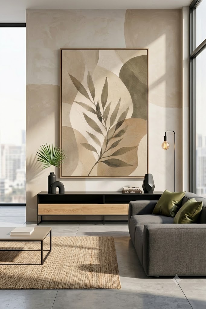
Why Wall Art Matters in Interior Design
Think of wall art as the finishing layer of a room. Without it, even beautifully furnished spaces can feel bare or incomplete. Artwork adds visual interest, introduces color and texture, and helps establish a focal point.
A large abstract canvas can bring energy to a minimalist living room, while soft botanical prints create a peaceful atmosphere in a bedroom. Vintage illustrations can add charm to a farmhouse kitchen, and black-and-white photography gives a home office a sophisticated touch.
Beyond aesthetics, wall art tells a story. It can reflect your travels, hobbies, favorite colors, or personal style. That’s why the best interiors feel unique rather than copied from a showroom.
Start with the Purpose of the Room
Before buying any artwork, consider how the room is used. Every space serves a different purpose, and the artwork should reinforce that feeling.
Living Room
The living room is where people gather, entertain, and relax, making it an ideal place for statement pieces. Large abstract paintings, landscapes, oversized photography, or textured canvases work particularly well because they immediately draw attention and anchor the room.
Bedroom
Bedrooms should encourage rest and relaxation. Choose calming artwork with soothing colors such as soft blues, greens, warm neutrals, blush tones, or muted earth shades. Nature scenes, watercolor florals, and minimalist prints create a peaceful environment without overwhelming the space.
Dining Room
Dining rooms benefit from artwork that encourages warmth and conversation. Botanical prints, still-life paintings, wine-themed art, or contemporary abstract pieces with warm color palettes help create an inviting atmosphere.
Kitchen
Kitchens are perfect for smaller decorative prints. Herb illustrations, vintage food advertisements, coffee-themed artwork, fruit studies, or simple typography can add personality without cluttering the room.
Home Office
Your workspace should inspire creativity and focus. Consider maps, architectural sketches, modern geometric art, motivational typography, or calming landscapes that reduce visual stress.
Bathroom
Bathrooms often receive the least decorative attention, yet framed coastal photography, botanical illustrations, spa-inspired prints, or subtle abstract art can instantly make the space feel more luxurious.
Choose Artwork That Matches Your Interior Style
The style of your artwork should complement your home’s design rather than compete with it.
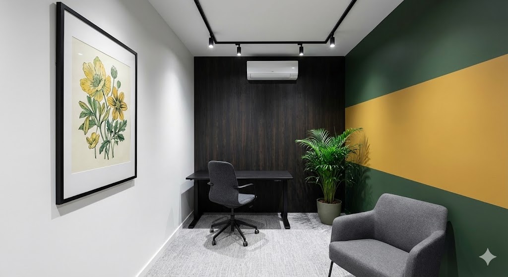
Modern Homes
Modern interiors pair beautifully with bold abstract paintings, oversized canvases, black-and-white photography, and geometric artwork.
Farmhouse Style
Choose vintage botanical prints, rustic landscapes, antique maps, or wooden framed artwork with soft, muted colors.
Coastal Interiors
Beach photography, ocean paintings, shells, coral illustrations, sailboats, and watercolor seascapes enhance a coastal aesthetic.
Scandinavian Style
Simple line art, neutral landscapes, monochrome photography, and minimal illustrations fit perfectly within Scandinavian interiors.
Traditional Homes
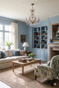
Oil paintings, classic portraits, landscapes, and elegant gold-framed artwork complement traditional décor.
Bohemian Spaces
Boho interiors embrace woven wall hangings, textile art, macramé, botanical illustrations, eclectic gallery walls, and handmade pieces that add texture and warmth.
Choose the Right Color Palette
Artwork doesn’t have to match your room exactly, but it should feel connected to the overall design.
One effective approach is to repeat one or two colors already found in your space. For example, if your sofa features navy cushions, choosing artwork with subtle navy accents helps create a cohesive look.
Another option is to use artwork as an accent. A neutral room can instantly come alive with a painting that introduces rich emerald green, burnt orange, or deep terracotta.
If your room already contains many bold colors and patterns, consider more neutral artwork to provide visual balance.
The Most Important Rule: Get the Size Right
One of the biggest decorating mistakes is choosing artwork that’s too small. Even beautiful pieces lose their impact when they appear to float awkwardly on a large wall.
Instead of selecting artwork based solely on the image, start by measuring the wall and nearby furniture.
Small Walls
Small walls, narrow hallways, reading corners, and compact spaces work best with artwork between:
- 8 × 10 inches
- 11 × 14 inches
- 12 × 16 inches
- 16 × 20 inches
Smaller prints also work well when displayed on picture ledges or layered with decorative accessories.
Medium Walls
Bedrooms, dining rooms, offices, and average-sized walls generally suit artwork ranging from:
- 18 × 24 inches
- 20 × 30 inches
- 24 × 36 inches
These sizes create enough visual impact without overwhelming the room.
Large Walls
Large blank walls require artwork that fills the space confidently.
Good choices include:
- 30 × 40 inches
- 36 × 48 inches
- Oversized canvas art
- Triptychs (three-panel artwork)
- Large gallery walls
Oversized artwork often creates a cleaner and more sophisticated look than filling the wall with many unrelated small frames.
The 60–75% Rule Designers Follow
Interior designers often use one simple guideline when hanging artwork above furniture.
The artwork should cover approximately 60–75% of the furniture’s width.
For example:
| Furniture Width | Ideal Artwork Width |
|---|---|
| 48-inch console | 30–36 inches |
| 60-inch dresser | 36–45 inches |
| 72-inch bed | 43–54 inches |
| 84-inch sofa | 50–63 inches |
| 96-inch sectional | 58–72 inches |
Following this rule keeps the artwork visually balanced and prevents it from looking too small or too large.
How High Should You Hang Wall Art?
One of the most common decorating mistakes is hanging artwork too high.
A widely accepted guideline is to position the center of the artwork approximately 57–60 inches from the floor. This measurement is often referred to as eye level and is commonly used in museums and galleries because it feels comfortable for most viewers.
However, furniture placement changes this rule slightly.
When hanging artwork above a sofa, bed, console table, or sideboard, focus on the relationship between the furniture and the artwork rather than the floor alone.
The bottom edge of the frame should typically sit 6–10 inches above the furniture. This keeps the artwork visually connected to the piece below instead of appearing to float independently on the wall.
How to Display Wall Art Above Furniture
The area above furniture is often the focal point of a room, making proper placement essential.
Above a Sofa
A single oversized canvas or a set of coordinated prints works beautifully above a sofa. Keep the artwork about two-thirds the width of the sofa and leave 6–10 inches of space between the sofa and the bottom of the frame.
Above a Bed
Choose artwork that spans roughly two-thirds of the headboard’s width. Position it close enough to feel connected but high enough to avoid accidental contact when sitting up in bed.
Above a Console Table
Whether placed in an entryway or dining room, artwork above a console should maintain the same 6–8 inch spacing rule and remain centered over the furniture.
Above a Fireplace
Fireplaces naturally draw attention, so artwork should complement rather than overpower the mantel. Leave a few inches of breathing room above the mantel, and choose a piece that is proportionate to the fireplace’s width.
Avoid These Common Sizing Mistakes
Even beautiful artwork can look out of place if it’s displayed incorrectly. Before hanging your frames, avoid these common errors:
- Choosing artwork that’s too small for a large wall.
- Hanging pieces too close to the ceiling.
- Ignoring the width of nearby furniture.
- Mixing unrelated frame sizes without a clear plan.
- Filling every inch of wall space instead of leaving some negative space.
- Buying artwork before measuring the available wall.
Taking measurements first will save time, money, and unnecessary nail holes.
The Best Wall Art for Every Room
While the general rules of size and placement apply throughout your home, each room has unique needs. Choosing artwork that complements the room’s purpose will make your home feel more intentional and cohesive.
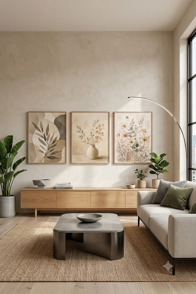
Living Room Wall Art
The living room is often the largest and most social space in the home, making it the ideal place for statement artwork.
Best Choices for Living Room Walls
- Oversized abstract paintings
- Landscape photography
- Textured canvas art
- Triptych wall art
- Large botanical prints
- Modern geometric designs
If your sofa sits against a large blank wall, don’t be afraid to choose one dramatic piece instead of several small frames. A single oversized artwork creates a cleaner, more luxurious appearance.
Designer Tip
Repeat one or two colors from your rug, throw pillows, or curtains within your artwork to tie the room together effortlessly.
Bedroom Wall Art
Your bedroom should feel calm, restful, and personal. Artwork should support relaxation rather than create visual noise.
Best Choices for Bedroom Walls
- Watercolor landscapes
- Botanical illustrations
- Minimalist line art
- Soft abstract paintings
- Floral photography
- Neutral-toned canvas prints
Avoid overly bright colors or busy patterns directly above the bed if your goal is a peaceful retreat.
Placement Tip
If hanging two pieces above bedside tables, keep them at the same height for a balanced look.
Dining Room Wall Art
Dining rooms benefit from artwork that encourages conversation and complements shared meals.
Best Choices for Dining Room Walls
- Still-life paintings
- Wine-themed artwork
- Fruit illustrations
- Botanical collections
- Warm abstract art
- Vintage café posters
Large artwork centered on the longest wall often creates the strongest visual impact.
Kitchen Wall Art
Kitchen artwork should add charm without overwhelming a practical workspace.
Great Ideas
- Coffee-themed prints
- Herb illustrations
- Vintage recipe artwork
- Farmers’ market posters
- Bread or pastry sketches
- Citrus botanical prints
For open shelving, lean smaller framed prints against the wall for a relaxed, layered look.
Bathroom Wall Art
Bathrooms deserve decorative attention too.
Since humidity is higher, choose moisture-resistant frames or canvas prints.
Popular Choices
- Coastal photography
- Seashell illustrations
- Botanical prints
- Spa-inspired artwork
- Minimal line drawings
- Watercolor landscapes
Soft blues, greens, whites, and sandy neutrals help create a relaxing spa atmosphere.
Entryway Wall Art
Your entryway introduces guests to your home’s personality.
Best Options
- One oversized statement piece
- Family photo gallery
- Decorative mirror paired with artwork
- Abstract canvas
- Local landscape photography
If space is limited, hang a vertical piece to draw the eye upward and make the entry feel taller.
Home Office Wall Art
Artwork in a home office should inspire creativity while minimizing distractions.
Great Choices
- Architecture prints
- World maps
- Inspirational typography
- Modern abstracts
- Nature photography
- Black-and-white cityscapes
Keep the artwork visible during work but avoid placing busy pieces directly behind your computer monitor.
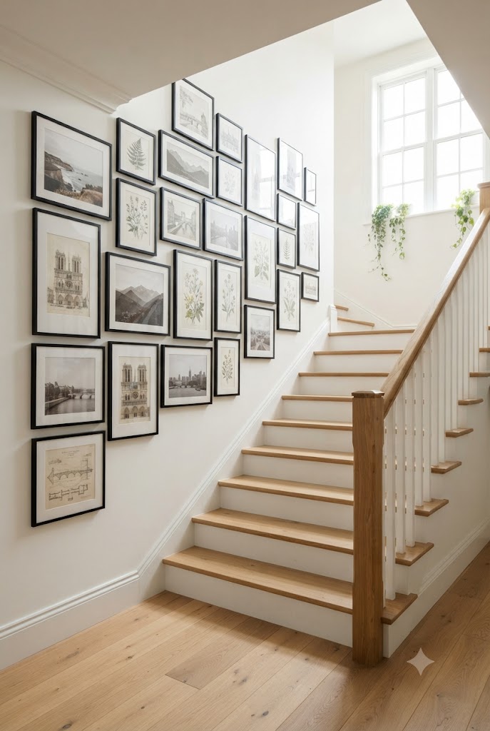
Hallways and Staircases
These transition spaces are perfect for gallery walls.
You can display:
- Travel photography
- Family memories
- Botanical collections
- Vintage illustrations
- Black-and-white prints
For staircases, follow the angle of the stairs while maintaining consistent spacing between each frame.
Gallery Wall Layouts That Always Work
Gallery walls allow you to display multiple pieces while adding personality and visual interest.
Before hanging anything, arrange the layout on the floor or create paper templates to tape on the wall. This simple step prevents unnecessary holes and helps you refine the composition.
Symmetrical Grid
Perfect for:
- Modern interiors
- Minimalist homes
- Home offices
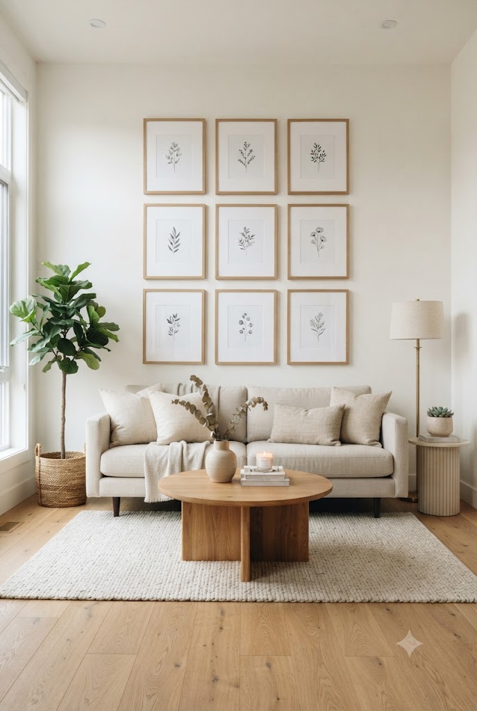
Use matching frame sizes with equal spacing to create a clean, structured look.
Organic Gallery Wall
Best for:
- Farmhouse
- Boho
- Eclectic interiors
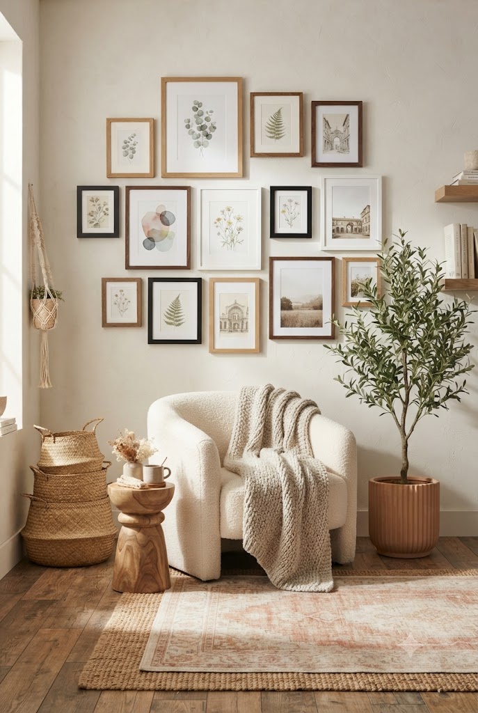
Mix different frame sizes while keeping a consistent gap between each piece. Start with the largest artwork in the center and build outward.
Linear Arrangement
Ideal above:
- Sofas
- Beds
- Dining buffets
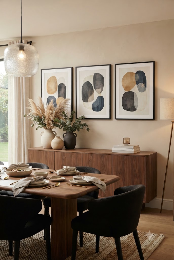
Arrange three or five pieces in a straight horizontal line for a balanced, contemporary appearance.
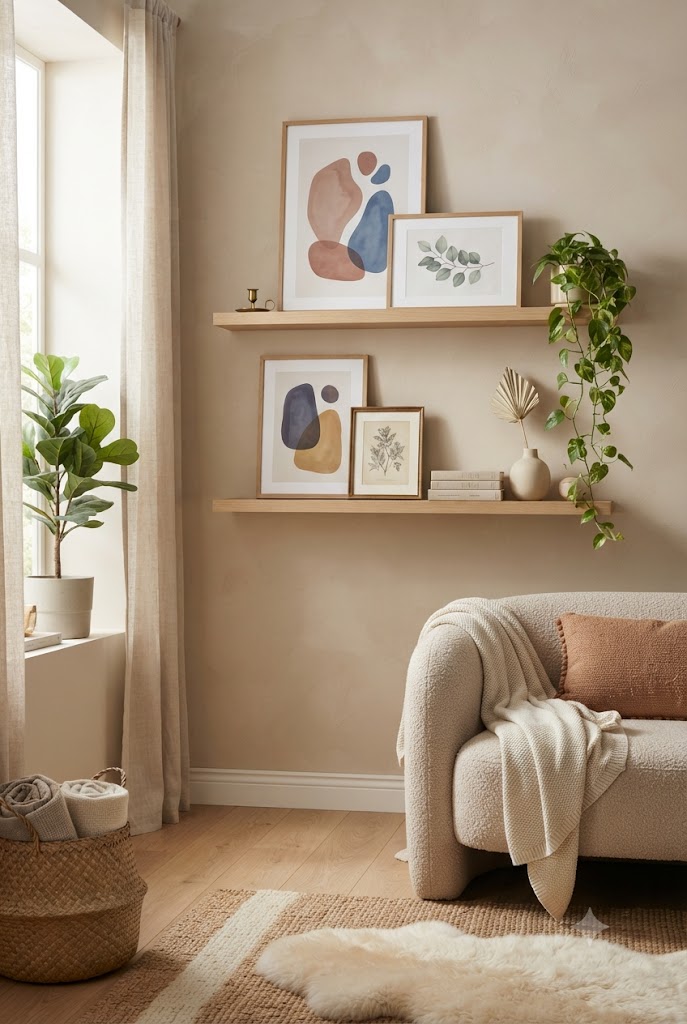
Picture Ledges
Picture ledges make it easy to refresh your décor without creating new nail holes.
Layer frames of different heights, add small plants, candles, or decorative objects, and rotate artwork seasonally for a fresh look.
How Much Space Should You Leave Between Frames?
Consistent spacing is one of the biggest differences between amateur and professionally styled gallery walls.
Recommended Spacing
- Small gallery walls: 1–2 inches
- Standard arrangements: 2–3 inches
- Large oversized displays: 3–5 inches
Uniform spacing creates rhythm and makes the collection feel intentional, even when frame sizes vary.
Choosing the Right Frame
A frame should enhance the artwork—not compete with it.
Black Frames
Modern, timeless, and versatile. Perfect for photography and contemporary prints.
White Frames
Ideal for Scandinavian, coastal, and minimalist interiors. They keep the display light and airy.
Natural Wood Frames
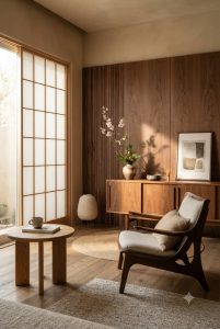
Great for farmhouse, Japandi, rustic, and bohemian styles. They add warmth and texture.
Gold Frames
Elegant and sophisticated, especially for traditional interiors or vintage artwork.
Floating Frames
Excellent for canvas paintings because they create depth while maintaining a clean appearance.
Should All Frames Match?
Not necessarily. Matching frames create a formal, cohesive look, while mixing complementary finishes can add character. If you mix frame styles, keep at least one element consistent—such as color, material, or mat size—to maintain harmony.
Lighting Makes Artwork Look Better
Even beautiful artwork can lose its impact in poor lighting.
Consider these options:
- Picture lights above statement pieces
- Adjustable wall sconces
- Directional recessed lighting
- Track lighting for gallery walls
- Warm white LED bulbs (2700K–3000K) for a cozy ambiance
Avoid placing artwork where direct sunlight can cause colors to fade over time.
Designer Styling Secrets
Professional designers use a few simple tricks to make wall art look intentional and luxurious.
- Mix canvas art with framed prints for added texture.
- Pair artwork with mirrors to reflect light and make rooms feel larger.
- Repeat colors from rugs, cushions, or curtains within your artwork for a cohesive palette.
- Don’t be afraid of oversized art—a single large piece often has more impact than many small ones.
- Leave negative space around artwork so each piece has room to breathe.
- Layer smaller framed prints on shelves or mantels instead of hanging every piece.
- Rotate artwork seasonally to keep your décor feeling fresh.
- Use pairs or sets of artwork to create symmetry in bedrooms and dining rooms.
Common Wall Art Mistakes to Avoid
Even expensive artwork can look out of place if it’s displayed incorrectly. Watch out for these common mistakes:
- Hanging artwork too high.
- Choosing pieces that are too small for the wall.
- Ignoring the scale of nearby furniture.
- Using inconsistent spacing between gallery wall frames.
- Mixing too many unrelated frame styles.
- Covering every inch of wall without leaving negative space.
- Forgetting to measure before buying artwork.
- Choosing art that clashes with the room’s color palette.
- Neglecting proper lighting.
- Creating a gallery wall without planning the layout first.
Quick Reference: Wall Art Rules at a Glance
| Rule | Recommendation |
|---|---|
| Artwork above furniture | Cover 60–75% of the furniture width |
| Hanging height | Center at 57–60 inches from the floor |
| Gap above furniture | 6–10 inches |
| Frame spacing | 2–3 inches |
| Gallery wall spacing | 2–3 inches (1–2 inches for small layouts) |
| Large blank walls | Oversized art or a gallery wall |
| Small walls | One medium print or a pair of small prints |
| Color coordination | Repeat one or two room colors in the artwork |
| Lighting | Warm white (2700K–3000K) picture or accent lighting |
Final Thoughts
Choosing wall art is about more than simply filling an empty wall. The right artwork enhances your home’s personality, creates balance, and transforms ordinary rooms into inviting spaces. By selecting pieces that suit each room’s purpose, following proper sizing guidelines, and hanging them at the correct height, you can achieve a polished look that feels professionally designed.
Remember to measure your wall before buying, keep artwork proportional to nearby furniture, and allow enough breathing room between frames. Whether you prefer a single oversized canvas or a carefully curated gallery wall, thoughtful placement makes all the difference. Most importantly, choose artwork that reflects your style and makes your home feel uniquely yours.
Related
- How to Create Stunning Wall Art Without Being a Pro: A Complete Guide
- The Sofa Placement Rules Designers Actually Follow
- Art Deco Bedroom Ideas for a Glam, Cozy & Stylish 2025 Retreat
FAQs: How to Choose Wall Art and Display Guide
What size should wall art be?
The right size depends on your wall and furniture. As a general rule, artwork should cover 60–75% of the width of the furniture beneath it. For large blank walls, oversized art or a gallery wall creates the best visual balance.
How high should wall art be hung?
For most rooms, hang artwork so the center is about 57–60 inches (145–152 cm) from the floor. When hanging art above furniture, leave 6–10 inches (15–25 cm) between the bottom of the frame and the top of the furniture.
How much space should I leave between multiple frames?
For gallery walls, keep 2–3 inches (5–8 cm) of spacing between frames for a clean, cohesive look. Smaller arrangements can use 1–2 inches, while larger displays may need up to 4 inches.
Should wall art match my furniture?
Not exactly. Instead of matching furniture perfectly, choose artwork that complements your room’s colors, textures, and overall style. Repeating one or two accent colors from your décor helps create a cohesive design.
Is one large piece of wall art better than several small pieces?
It depends on the space. A single oversized artwork creates a bold focal point on large walls, while a thoughtfully arranged gallery wall adds personality and visual interest. Avoid using several tiny frames on a large wall, as they can look out of proportion.
Can I mix different frame styles in a gallery wall?
Yes. Mixing frame styles can create an eclectic, curated look, but it’s important to keep one element consistent, such as the frame color, material, or artwork theme. This helps the arrangement feel intentional rather than cluttered.



One Comment