
Luxury Asian Color Psychology: How Designers Create Calm, Sophisticated Interiors
Introduction to Luxury Asian Color Psychology
Color is one of the most powerful tools in interior design, yet luxury Asian homes rarely rely on bright, attention-grabbing shades. Instead, they use carefully curated palettes inspired by nature, architecture, and handcrafted materials. Every color has a purpose—whether it’s creating warmth, enhancing natural light, or adding depth without overwhelming the room.
Unlike many modern decorating trends that frequently change with the seasons, Asian luxury home décor embraces timeless color combinations that remain elegant for years. Soft neutrals, rich wood tones, earthy greens, and subtle black accents work together to create interiors that feel peaceful, refined, and welcoming.
Rather than decorating with dozens of colors, professional designers typically build a room around a neutral foundation and introduce one or two accent colors through textiles, artwork, ceramics, or furniture. This restrained approach allows every detail to stand out while maintaining visual harmony.
Table of Contents
1. The Foundation: Warm Neutrals That Never Go Out of Style
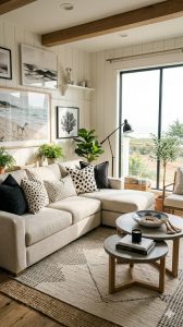
Every luxurious Asian-inspired home begins with a calm, neutral backdrop. These colors reflect natural materials such as stone, sand, clay, and untreated wood, creating a soft and inviting atmosphere.
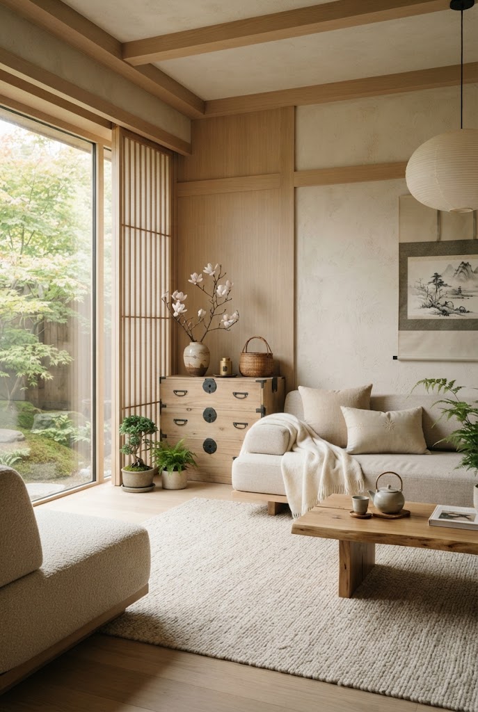
Popular neutral shades include:
- Warm ivory
- Cream
- Soft beige
- Sand
- Oatmeal
- Light taupe
- Warm greige
These colors make rooms appear brighter and larger while allowing furniture, artwork, and natural textures to become the focal points.
Best Places to Use Neutral Colors
- Living room walls
- Bedroom walls
- Large sofas
- Curtains
- Area rugs
- Ceiling paint
Neutral foundations also make it easier to update your décor over time without repainting the entire room.
2. Rich Wood Tones: The Heart of Asian Luxury
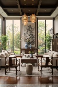
Wood is more than just a material—it’s one of the defining features of Asian-inspired interiors. Instead of using bright painted furniture, designers often showcase the natural beauty of wood grain through carefully selected finishes.
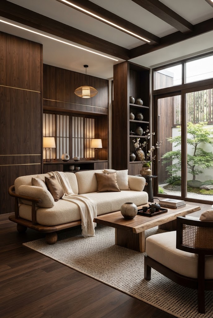
Popular wood tones include:
- Walnut
- Teak
- White oak
- Ash wood
- Dark elm
- Rosewood-inspired finishes
These warm tones instantly make a space feel grounded and luxurious.
Wood can be incorporated through:
- Dining tables
- Coffee tables
- Platform beds
- Ceiling beams
- Wall panels
- Shelving
- Console tables
A room with beautiful wood furniture often requires fewer decorative accessories because the material itself becomes part of the design.
Designer Tip
Avoid mixing too many different wood finishes in one room. Sticking to two or three complementary tones creates a more polished and cohesive look.
3. Earth Tones Bring Warmth and Balance
Earth-inspired colors help create the calming atmosphere associated with Asian interiors. These shades connect the home to nature and pair beautifully with wood, stone, and natural textiles.
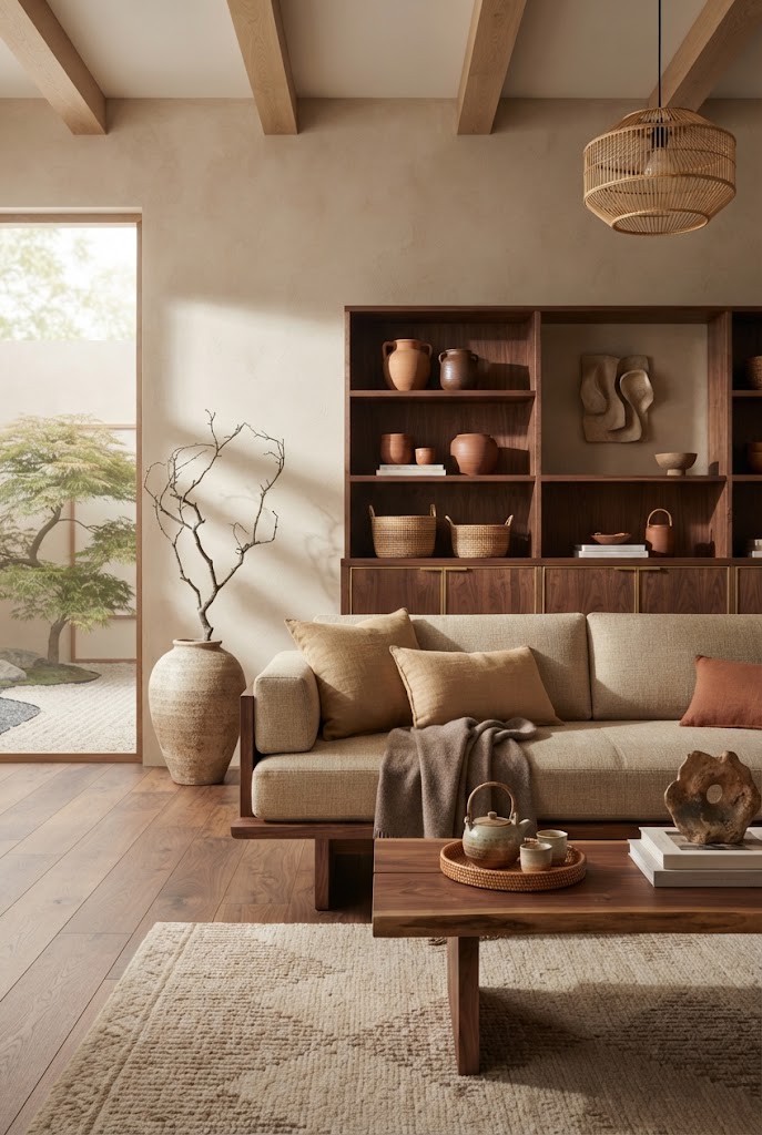
Popular earthy colors include:
- Clay
- Terracotta
- Warm brown
- Camel
- Cinnamon
- Mushroom
- Soft olive
Earth tones work particularly well in living rooms, dining areas, and entryways where you want guests to feel relaxed and welcomed.
Introduce these colors through:
- Linen cushions
- Throws
- Pottery
- Upholstery
- Artwork
- Handmade rugs
Because earth tones are naturally muted, they blend effortlessly with neutral walls without making a room feel busy.
4. Jade and Sage Green: Nature’s Luxury Colors
Green is one of the signature colors in Asian luxury home décor because it symbolizes growth, harmony, and a strong connection to nature.
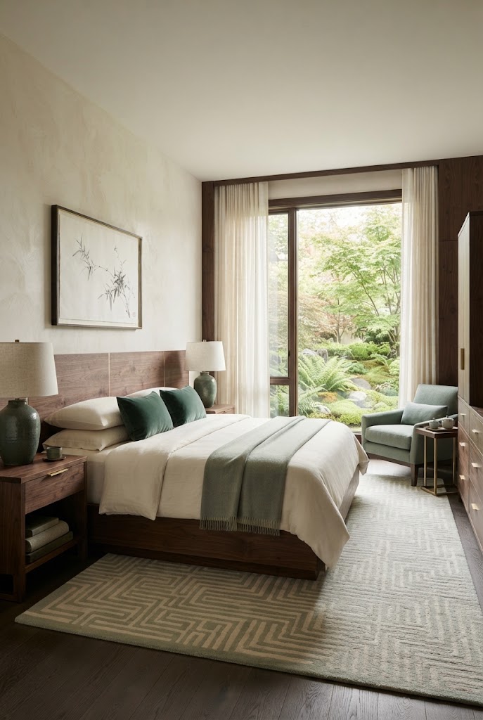
Rather than using vibrant emerald shades, luxury interiors favor softer, more sophisticated greens such as:
- Jade
- Sage
- Moss
- Olive
- Forest green
These colors pair beautifully with walnut wood, cream walls, black accents, and natural stone.
You can introduce green through:
- Upholstered accent chairs
- Decorative cushions
- Ceramic vases
- Artwork
- Indoor plants
- Curtains
Even a single large indoor plant can bring freshness and elegance to an otherwise neutral room.
5. Charcoal and Black: Adding Depth Without Overpowering
Many people hesitate to use black in their homes, but designers often rely on it to create contrast and sophistication.
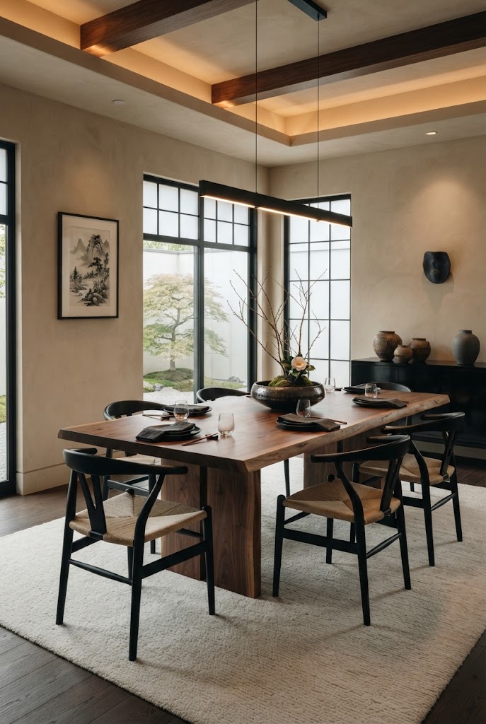
Instead of painting entire rooms black, luxury Asian interiors use charcoal and matte black sparingly to define the space.
Common applications include:
- Window frames
- Cabinet hardware
- Light fixtures
- Coffee table legs
- Picture frames
- Decorative trays
- Shelving
These darker accents help anchor lighter color palettes while making wood tones appear richer and more refined.
The key is moderation. Too much black can make a room feel heavy, while just a few accents create balance and visual interest.
6. Soft Stone Colors for a Spa-Like Feel
Stone-inspired shades add subtle texture and serenity, making them ideal for creating relaxing environments.
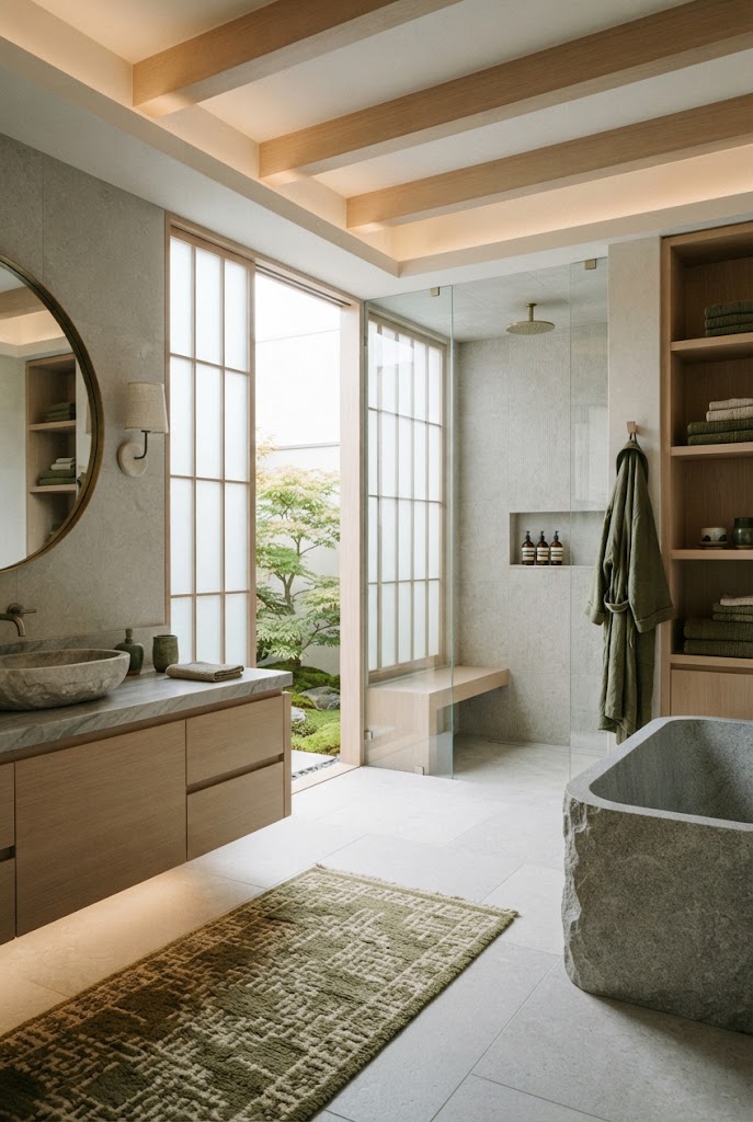
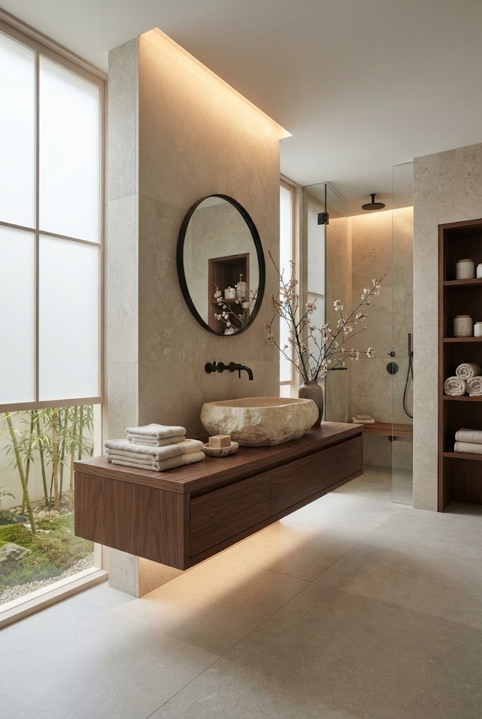
Think of colors inspired by:
- Limestone
- Travertine
- Marble
- River rocks
- Concrete
- Slate
These muted grays and warm stone tones work especially well in bathrooms, kitchens, and bedrooms where a calm atmosphere is essential.
Pair stone colors with:
- Light wood cabinetry
- White linen
- Matte ceramics
- Woven baskets
- Indoor greenery
This combination creates a spa-like aesthetic that feels luxurious without appearing overly formal.
7. Metallic Accents: Less Is More
Metallic finishes add refinement when used thoughtfully. Instead of covering a room in shiny gold or chrome, luxury Asian interiors use metals as subtle highlights.
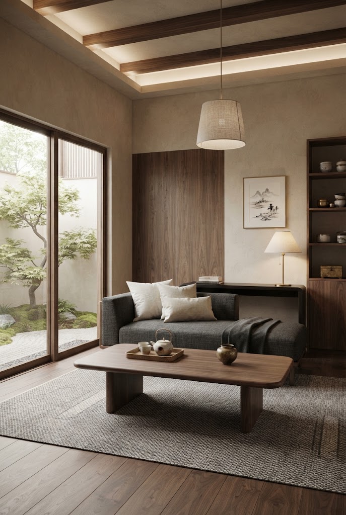
Popular choices include:
- Brushed brass
- Antique bronze
- Matte gold
- Blackened steel
Use metallic accents on:
- Cabinet handles
- Pendant lights
- Table lamps
- Mirror frames
- Decorative bowls
- Side tables
These small touches catch the light and elevate the overall design without distracting from the natural materials.
Creating a Balanced Color Palette
Professional designers rarely choose colors randomly. Instead, they follow a simple layering approach that keeps the room cohesive and visually appealing.
A practical formula is:
- 60% Base Color: Neutral shades such as cream, ivory, or warm beige.
- 30% Secondary Color: Wood tones, stone colors, or soft earth tones.
- 10% Accent Color: Jade green, charcoal black, muted bronze, or another complementary shade.
For example:
- Cream walls
- Walnut furniture
- Sage green cushions
- Black lighting fixtures
- Brass accessories
- Linen curtains
- Stone coffee table décor
This layered approach creates depth while maintaining the calm elegance that defines Asian luxury interiors.
Color Combinations Designers Love
If you’re unsure where to start, these timeless palettes are easy to recreate:
Warm & Organic
- Ivory
- Walnut
- Sage green
- Matte black
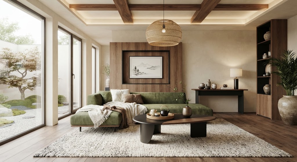
Perfect for living rooms and family spaces.
Spa Retreat
- Soft stone gray
- White oak
- Linen
- Olive green
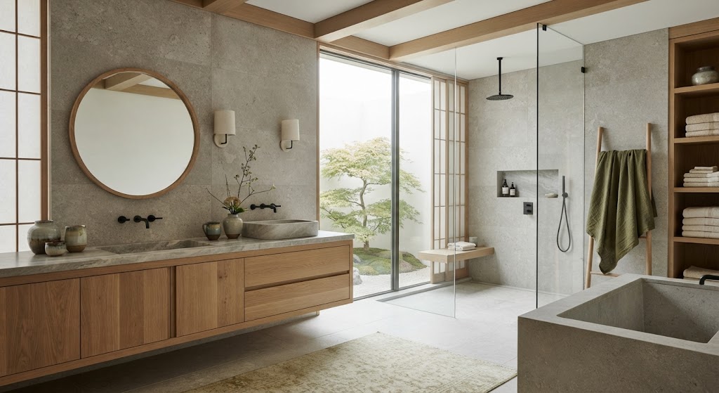
Ideal for bedrooms and bathrooms.
Modern Sophistication
- Cream
- Charcoal
- Walnut
- Brushed brass
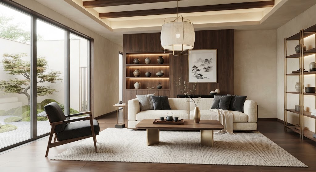
A refined palette for dining rooms or home offices.
Earthy Elegance
- Taupe
- Camel
- Dark wood
- Forest green
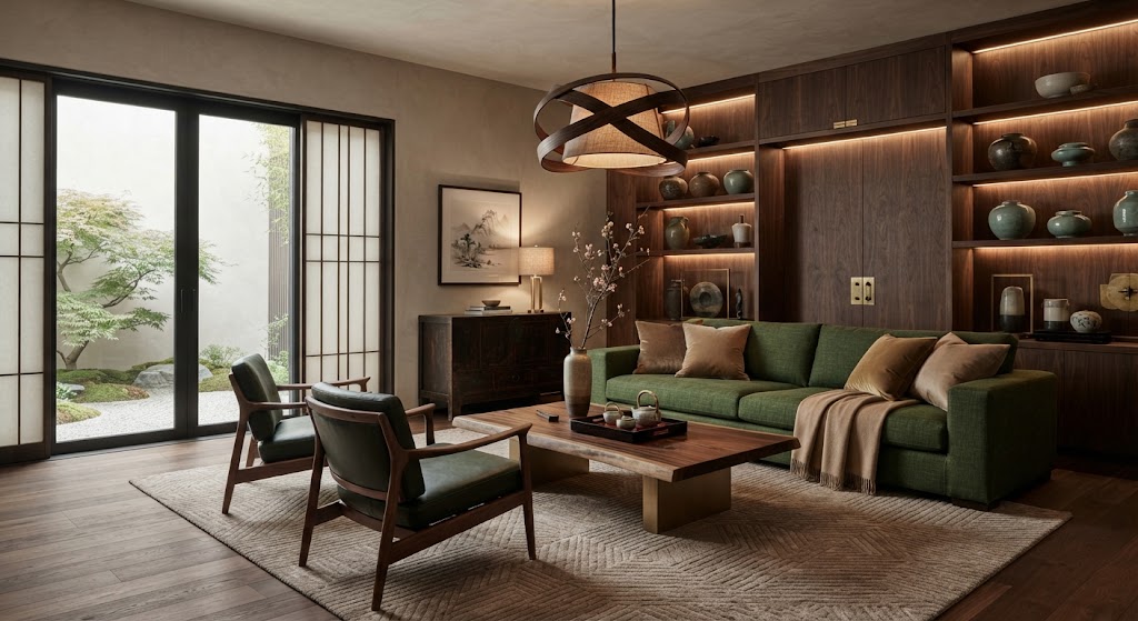
Creates a cozy, luxurious atmosphere throughout the home.
Common Color Mistakes to Avoid
Even the most beautiful colors can lose their impact if they’re not used thoughtfully. Here are a few mistakes that can prevent your home from achieving a true luxury feel.
Using Too Many Bold Colors
A room filled with several strong colors often feels chaotic rather than relaxing. Keep your palette restrained and let natural materials provide visual interest.
Ignoring Natural Light
Colors change throughout the day depending on the amount of sunlight a room receives. Always test paint samples in both morning and evening light before making a final decision.
Matching Everything Exactly
A luxury interior feels layered, not flat. Instead of matching every piece of furniture and décor, combine complementary shades and varied textures for a more natural, curated appearance.
Forgetting Texture
Color alone isn’t enough. Linen, wood, stone, silk, rattan, and ceramics all add depth and richness, making a neutral palette feel warm rather than plain.
Why Color Matters in Asian Luxury Design
The most elegant Asian-inspired homes aren’t memorable because they’re colorful—they’re memorable because they feel balanced. Every shade works together to create a peaceful environment where architecture, furniture, and natural materials take center stage.
By starting with timeless neutrals, introducing rich wood tones, and adding carefully chosen accents inspired by nature, you can create a home that feels sophisticated, welcoming, and effortlessly luxurious—without chasing passing trends.
Conclusion: Creating Calm Luxury Through Asian Color Psychology
Luxury Asian interiors are not created through color alone, but through the emotions and atmosphere those colors bring into a space. From peaceful neutrals and natural earth tones to meaningful accents like jade green, deep red, and indigo blue, every shade has a purpose in creating balance, harmony, and sophistication.
By understanding Asian color psychology, you can design a home that feels both elegant and deeply calming. The key is to choose colors that connect with nature, complement your lifestyle, and create a sense of quiet luxury rather than overwhelming decoration.
Whether you prefer a minimalist Japandi-inspired palette, a rich Chinese luxury aesthetic, or a warm modern Asian style, thoughtful color choices can transform your home into a serene retreat that feels timeless, intentional, and beautifully balanced.
FAQ: Luxury Asian Color Psychology
What is the 60-30-10 color rule?
A layering formula designers use to build a balanced palette: about 60% base color — neutral shades like cream, ivory, or warm beige; 30% secondary color — wood tones, stone colors, or soft earth tones; and 10% accent color — jade green, charcoal black, muted bronze, or another complementary shade.
Which colors define luxury Asian interiors?
The palette centers on warm neutrals like cream, ivory, and warm greige, layered with rich wood tones such as walnut and teak, earth tones like clay and terracotta, muted greens including jade and sage, and sparing accents of charcoal black and brushed brass or antique bronze.
How do I use black in an Asian-inspired room without making it feel heavy?
Use charcoal and matte black sparingly as accents rather than painting entire rooms black. Apply them to window frames, cabinet hardware, light fixtures, picture frames, and shelving. The key is moderation — too much black can make a room feel heavy, while just a few accents create balance and make wood tones appear richer.
What color mistakes should I avoid in Asian-inspired design?
Avoid filling a room with several strong colors, ignoring how natural light changes colors throughout the day, matching every piece of furniture exactly, and forgetting texture. Linen, wood, stone, silk, rattan, and ceramics add the depth that color alone can’t provide.
Can I use bold colors in a luxury Asian palette?
Designers favor muted, sophisticated tones, but bolder shades still have a place — keep them within the 10% accent share of the 60-30-10 formula. Jade green and charcoal black work well as accents. A room filled with several strong colors can feel chaotic rather than relaxing.




2 Comments