7 Cozy Fall Color Palettes for Every Room
When autumn arrives, many of us feel the pull to refresh our rooms — not with a full renovation, but with color. A new cushion here, a deeper curtain there, and suddenly the whole house feels like the season. The trick is choosing a small palette for each room so everything looks intentional rather than thrown together.
Below are seven fall color palettes, one for each room, built around warm, natural tones that suit a modern cottage home. Each one names the colors, shows where to use them, and includes a budget-friendly way to try it — because a seasonal refresh should never require a designer’s budget.
Table of Contents
1. Living Room: Terracotta, Warm Caramel & Cream
This is the classic fall living room trio: terracotta for warmth, caramel for that golden-harvest glow, and cream to keep everything light and livable.
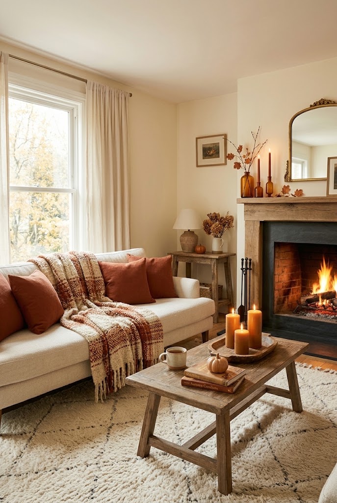
Where to use it: Terracotta throw pillows or a woven blanket on the sofa, caramel-toned candles on the coffee table, and cream curtains or a light rug as the calm base. If you have a fireplace mantel, group amber and rust candles there for the layered look designers favor.
Budget-friendly tip: You don’t need new furniture. Slipcovers or cushion covers in terracotta cost far less than reupholstery, and switching out just your pillow covers and a throw instantly changes the room’s temperature. (If you love earthy living rooms, my roundup of earthy neutral palettes for a modern farmhouse living room explores similar ground in more detail.)
2. Bedroom: Sage Green, Oat & Warm Linen
For the bedroom, fall should feel restful, not heavy. Sage green — a muted, gray-tinted green — reads as nature indoors, while oat and warm linen keep things soft and layered.
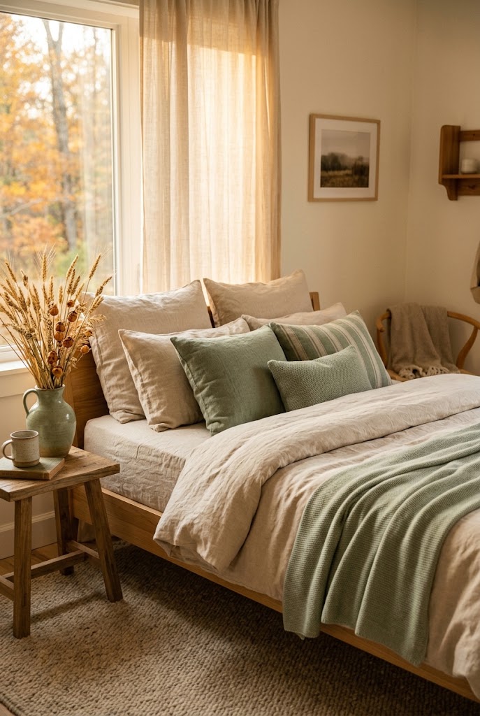
Where to use it: Oat-colored bedding as the base, sage cushions or a lightweight sage throw at the foot of the bed, and warm linen curtains that glow in low autumn light. A sage-green vase of dried wheat or pampas grass on the nightstand adds texture without clutter.
Budget-friendly tip: Bedding is the fastest bedroom refresh. Buying one new duvet set or two pillow shams in sage costs far less than redecorating, and because sage is a neutral-adjacent color, it will work again in spring.
3. Kitchen: Honey Wood, Mustard & Ivory
Kitchens are workhorse rooms, so the palette should feel warm without getting fussy. Honey wood (think mid-tone oak), mustard, and ivory hit that note — golden, cozy, and easy to live with.
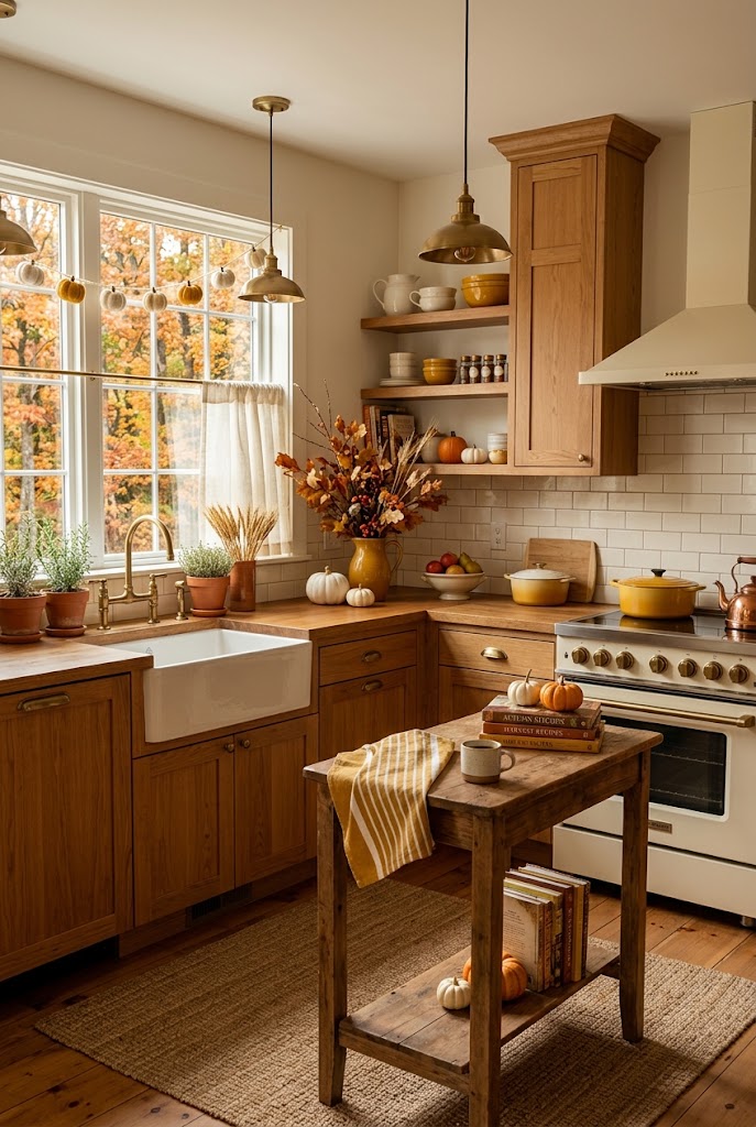
Where to use it: Let your wooden cutting boards, utensils, and a bowl of lemons or gourds do the talking. Mustard linen napkins or a folded tea towel on the counter, and ivory ceramics on open shelves to brighten everything up.
Budget-friendly tip: Kitchen color changes best happen with textiles and displays you already own. Swap your dish towels to mustard, fill a wooden tray with seasonal produce, and the room turns autumnal for the price of a grocery trip.
4. Dining Room: Burnt Sienna, Olive & Flax
The dining room deserves a palette with a little drama — it’s where you’ll gather for the whole season. Burnt sienna (a deep, reddish orange) with olive and natural flax is rich but still relaxed.
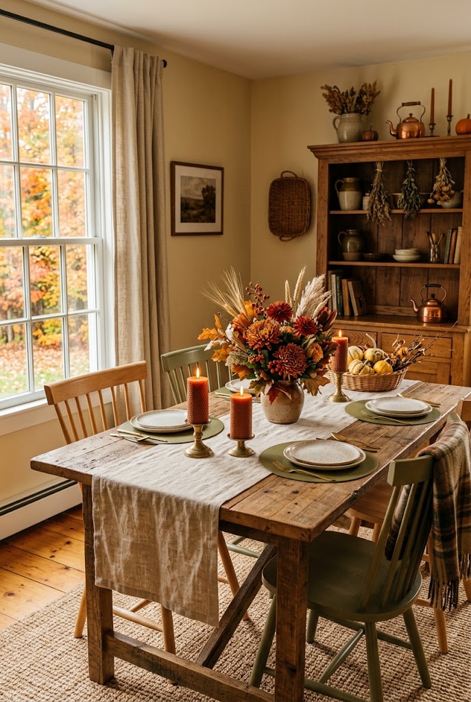
Where to use it: A flax or natural-linen table runner, olive placemats or chargers, and burnt sienna candles or a low centerpiece of rust-colored blooms and dried grasses. These tones photograph beautifully, which matters if you love sharing your table online.
Budget-friendly tip: One roll of linen-like fabric from the craft store becomes a runner, napkins, and ribbon for napkin rings. Cutting your own fabric lengths is a fraction of the cost of a matching table-linen set.
5. Entryway: Rust, Camel & Soft Charcoal
Your entryway sets the tone for the whole house, and a small space can handle deeper color. Rust and camel keep it warm and welcoming, with a touch of soft charcoal for grounding.
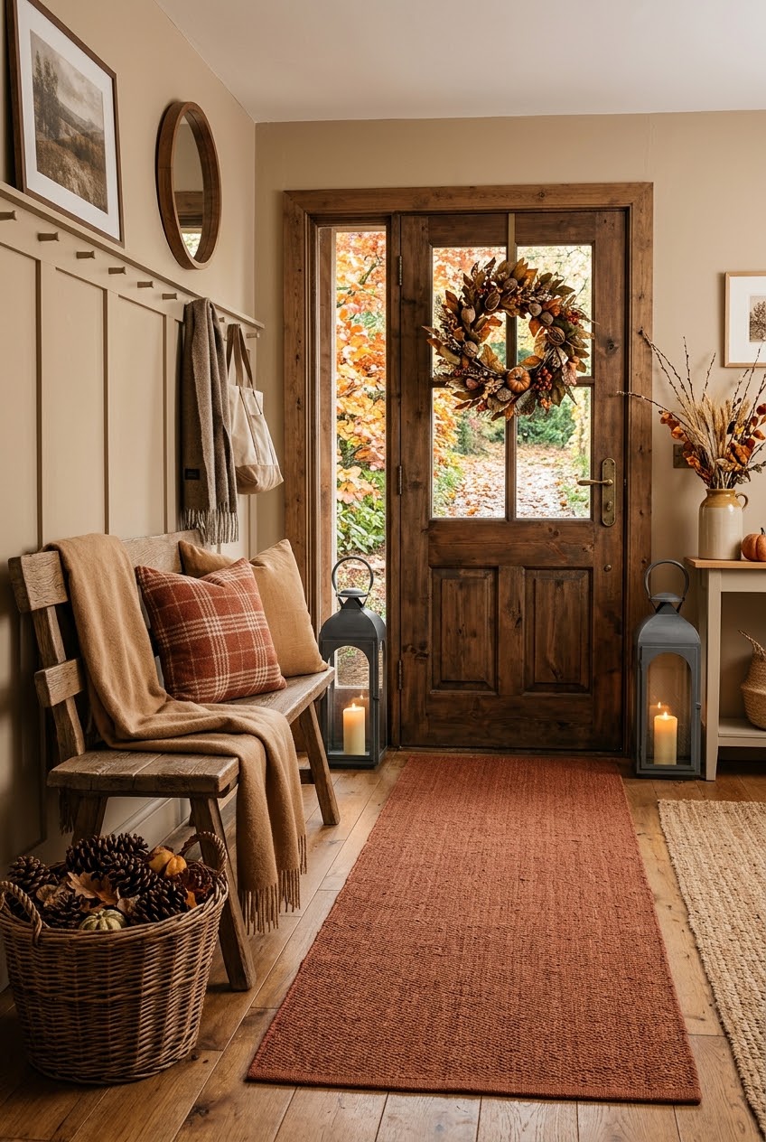
Where to use it: A rust-colored doormat or small runner, camel throws draped on a bench, and a charcoal lantern or two framing the door. A basket of pinecones or dried leaves by the entrance completes the first impression.
Budget-friendly tip: Entryways are small, which is an advantage — a single paint sample pot can refresh a picture frame, a basket, or a small side table. My fall entryway décor ideas post has more ways to make this hardworking space feel seasonal.
6. Bathroom: Warm Taupe, Clay & Soft White
Bathrooms often get ignored in seasonal decorating, but they’re where you start and end every day. Warm taupe walls or towels, clay accents, and soft white basics make the room feel like a small spa retreat.
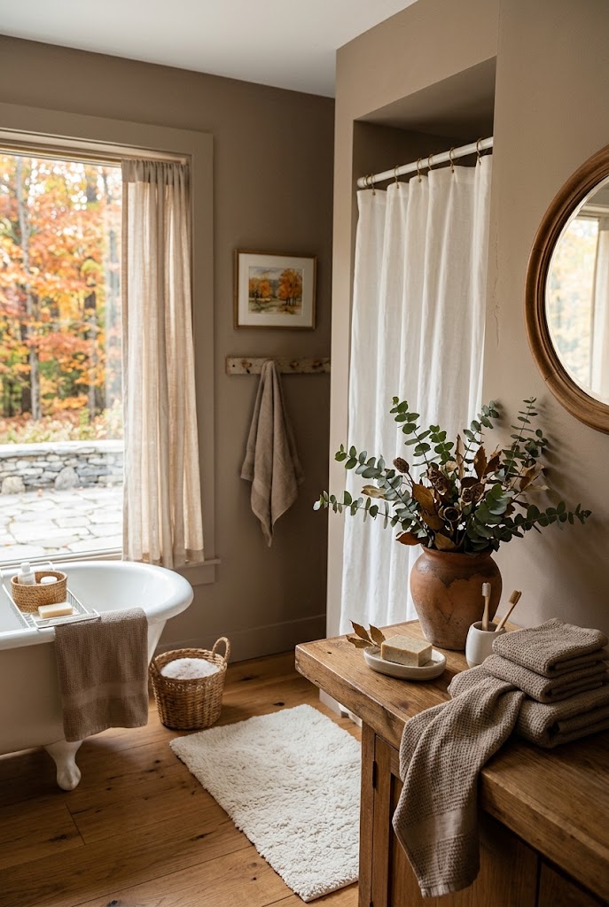
Where to use it: Swap in warm taupe towels, add a clay or terracotta pot holding eucalyptus on the counter, and keep everything else soft white — shower curtain, bath mat, soap dish. Eucalyptus also releases a gentle scent in a steamy room.
Budget-friendly tip: Towels and a small plant are all this room needs. Two new towel sets and one potted plant transform a bathroom for less than most people spend on a single dinner out.
7. Reading Nook: Espresso, Amber & Dusty Gold
Every home deserves a corner that invites you to sit down with a book. Deep espresso grounds the space, amber adds warmth, and dusty gold gives it a soft glow in lamplight.
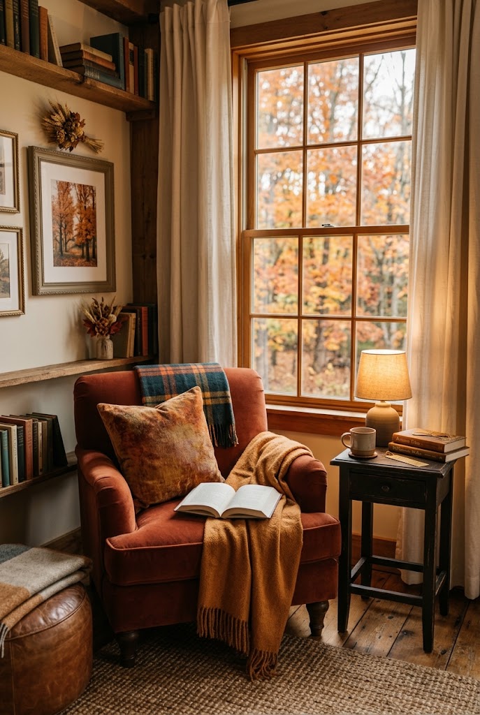
Where to use it: An espresso or dark-wood side table, an amber-toned throw and cushion on the chair, and a dusty gold picture frame or small lamp. Warm-toned lighting matters most here — a low-wattage bulb or a candle lantern changes the whole mood.
Budget-friendly tip: A reading nook can be built from furniture you already have: pull a chair into a corner, add a side table, and stack books as the base for your lamp. For more on how color shapes the way a room feels, my guide to color psychology in interior design explains why warm tones like these make us feel cozy.
How to Use These Palettes Together
You don’t need to use all seven — most homes will feel perfectly seasonal with three or four. The secret to cohesion is repetition: pick one color (say, terracotta) and let it appear in two or three rooms, while the other colors change. That thread of color is what makes a home feel designed rather than decorated room by room.
Also note: palettes work best when they’re layered with texture. Linen, wool, woven baskets, and dried botanicals all read as “fall” alongside these colors, and they’re what keep a color scheme from feeling flat. If you’re drawn to natural, earthy combinations generally, the cottage color palette guide is a good companion piece for year-round inspiration.
Conclusion
A fall refresh doesn’t have to mean new furniture or a big budget. Choosing one small, intentional palette per room — and repeating it through textiles, accents, and natural elements — is enough to make the whole house feel like autumn. Start with the room you spend the most time in, try the budget tip, and let the season do the rest.
Which palette would you try first? Save your favorites and come back when you’re ready to refresh the next room.